Showing posts with label grey. Show all posts

Friday, July 5, 2013

Contrary Polish Ain't No Sunshine

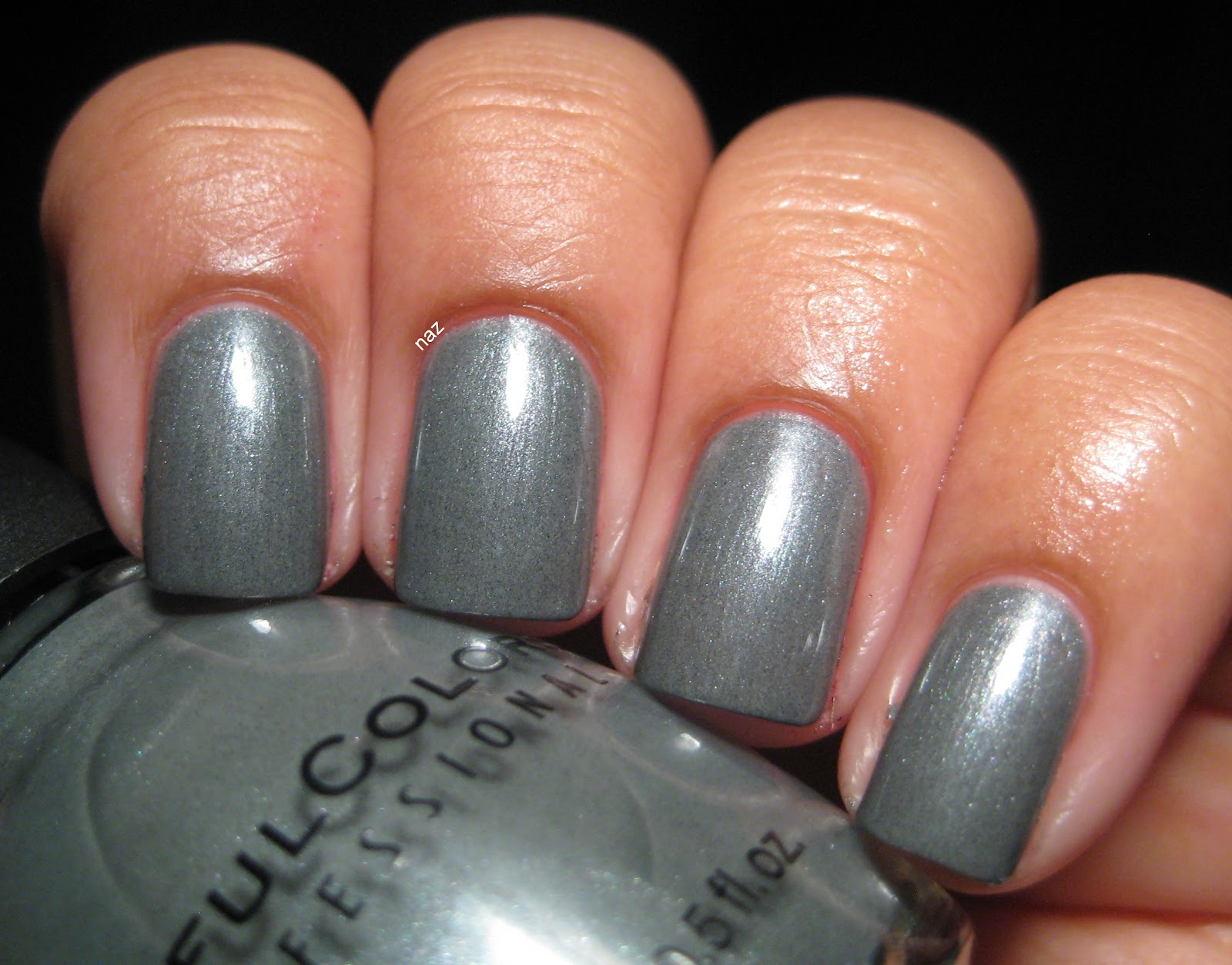
Today I have another lovely Contrary Polish to show you. Ain't No Sunshine is from the Love Lyrics collection that was released for this past Valentine's Day. Ain't No Sunshine is perfect in 3 thin coats, and needs a layer of top coat to bring out the awesomeness.


The shimmer is so delicate and pretty. Like my other Contraries, it's subtle but not hidden.


Great formula, too. Very smooth, and the brush was great as usual.


It reminds me a lot of Illamasqua Raindrops, but I prefer this. Raindrops is supposedly quite sheer, and based on swatches the shimmer looks a bit too subtle for my liking. Ain't No Sunshine is darker and bluer, of course, but I think that helps ensure that the shimmer is visible. Needless to say, I am no longer interested in Raindrops. I also want to note that this wore very well on me- after 4 days I had the tiniest hints of tipwear, but that's it. Me encanta. These grey-blues get me, every time.

Have you tried any of the Love Lyrics collection? Thoughts?

Thanks for looking and commenting, and have a great weekend!

Monday, May 27, 2013

Zoya Kelly

Zoya Kelly is from the Wonderful Collection released in Fall 2010. It's a lovely dark grey with purple undertones, making it distinct from the many other dark greys out there. Kelly is solid in 2 coats.


The formula had an oddly sticky feel to it, but at least it wasn't streaky.


I can't remember whether or not I used top coat for these pictures, but I do remember noticing how glossy Kelly is on its own. In addition to the stickiness, I noticed that this polish dried more slowly than usual, but not at an unreasonable pace...I changed my mind the next morning. I did this manicure at about 11 AM, and the next morning there were dings and some sheet marks. What.

I left it on for 5 days anyway because I didn't have time to fix it or change my manicure, so I have the results for you.


You can see some of the weirdness at my ring and pinky fingernails. No major chipping, which is good, but it's much much duller, and the tipwear was disappointing.


It's not the worst wear I've ever experienced, but it still looked pretty beat up after 5 days.

I'm not sure if it's my base and top coat combination, but I just don't seem to be compatible with Zoya cremes. I had lots of trouble with Pinta, and now Kelly's giving me similar issues. My go-to base coats are Essie Fill the Gap and Sally Hansen Hard as Wraps, and my top coat is pretty much always Revlon Quick Dry Top Coat.

I haven't come across any exact dupes for Kelly, but there are lots of dark greys out there. They seem to mostly have greenish undertones, like Essie Power Clutch, but there is also China Glaze Concrete Catwalk, which seems like a pretty neutral dark grey. If Zoya cremes don't give you trouble, and greenish greys don't suit you, I'd suggest Kelly. Despite the formula woes, it is a very nice color.

Have you tried Kelly? Did you have the same issues that I did?

Thanks for looking and commenting, and have a great week!

Friday, May 17, 2013

Contrary Polish Purple Smoke + Comparison

Happy Friday!! I am especially stoked today. I just finished my last final (Spanish), and I feel great about it. Today I've got for you a Contrary Polish that isn't necessarily as exciting as the others I've posted so far, but is still quite awesome.

Contrary Polish Purple Smoke is one of the original six colors. When I first saw it, I thought, eh, it's close enough to Paradoxal, Perplex, etc. and if you're not a fan of those greyish/taupe-y/purple colors, it probably is! However, I love them, and am quite pleased with Purple Smoke. It's opaque in 3 thin coats. In the shade:


Like the other Contraries, Purple Smoke is a subtle shimmer, but not at all hidden. Purple Smoke dries pretty matte, so you'll definitely need top coat. In the sun:


The shimmer in Purple Smoke isn't nearly as contrasting as some of the other colors, but I think it's lovely nonetheless. I've also compared it to Revlon Perplex and Barry M Dusky Mauve (an exact dupe for Chanel Paradoxal). I know, Perplex and Dusky Mauve are pretty close, but I chose to compare it with both because to me, Perplex is definitely more purple, and Dusky Mauve is more brown.

So, first up, Purple Smoke vs. Perplex. 2 coats of Perplex on the index and ring fingernails, with top coat.


As you can see, Perplex is darker, warmer, and more purple.

And Purple Smoke vs. Dusky Mauve. 2 coats of Dusky Mauve on the index and ring fingernails, plus top coat.


Like Perplex, Dusky Mauve is warmer and more purple than Purple Smoke, but Dusky Mauve is also a lot more taupe or brown-leaning. Purple Smoke looks blueish in comparison.

All three of these polishes have great formulas, so I'd recommend any of them. Out of these, Perplex will definitely be the easiest to obtain. It has been renamed Naughty, and is now core. Full-sized Contrary Polishes are available on Llarowe, Femme Fatale, and Shoppe Eclectico, but on Fridays, you can also buy minis straight from the Contrary Polish blog. For those of you in the US, Dusky Mauve will be the most troublesome to obtain- I bought mine on Ebay. Harlow and Co. sold Barry M at one point, but I don't see them on the site anymore. You can order directly from Barry M, but I know of someone who had quite a bit of trouble with them, and wouldn't recommend it.

Have you tried any of these? What did you think? Are you as much of a sucker for greyish purples as I seem to be?

Thanks for looking and commenting, and have a great weekend!

Monday, February 18, 2013

HARE King of Carat Flowers

Blegh, Monday. On the bright side, I have my first HARE polish to show you! King of Carat Flowers was released last fall with the Finders Keepers collection, which was packed with interesting and unexpected glitters. This is one that could be worn on its own, but I've been advised that layering really helps, so I chose to layer 2 coats of King of Carat Flowers over 2 coats of SHCSM Dorien Gray, which I've already gushed to you about.


Check it out! Yellow/gold glitter, lavender glitter, delicate gold shimmer, and glints of iridescent blue glitter in a light grey base. I really really love this. Let's take a closer look:


Since I layered it, application was a breeze, and I didn't have to place the glitter or anything. It distributed itself nicely with my normal application method. I had this on my wishlist for a few months before I caved and bought it, and I'm so glad it didn't disappoint! Now I just need to get my hands on Bisbee and Archipelago.

Do you have any HAREs? What do you think?

Thanks for looking and commenting, and have a great week!

Wednesday, February 6, 2013

SHCSM Greige Gardens + Lynnderella Connect the Dots

SHCSM Greige Gardens is a relatively new core color. I don't know details of the release, but I started seeing it in stores last spring. I love these types of greige/purple-y colors, but I always worry about how they'd look against my skintone, so I never bought any, but I recently found Greige Gardens on clearance at Target, and decided to cave. I'm glad I did, because it is lovely.


This is 4 coats, without top coat. It dries glossy, and the formula is smooth, but it's a lot more sheer than I think a creme should be. 4 coats for a creme is a bit much. I'm hoping this will go the way of Dorien Grey and improve with time, because I really like this color.


Then I decided to top it with 2 coats of Lynnderella Connect the Dots, and one coat of Gelous. I am in love with this combination.


YAY, square glitter! Those black squares are my favorite part of Connect the Dots, aside from the gigantic black hexes. I know there are tons of alternatives and approximations of Connect the Dots out there, and lots of drama associated with all this, but I still think this one is the nicest. Even with the bar glitter. Can't believe I'm saying this, but I think the bar glitter fits in really nicely with the other glitters, without reminding me of bacilli or beard trimmings.

It's also worth noting that I've now had this polish for roughly a year and a half, and I've had no issues with sinking glitter, or warping/bleeding/melting, so I'm very pleased in that regard. I totally understand why extensive testing isn't practical for indies, but it is still one of my concerns as a consumer, so I thought I'd throw that in there. If only Lynnderellas still cost $12...

Now, let's talk about similar polishes. For Greige Gardens, three polishes come to mind: Parlez Vous OPI?, A-England Guinevere, and China Glaze Below Deck. Parlez Vous OPI is warmer, more purple, and discontinued; Guinevere is more purple, although I have a hard time judging warmth vs. coolness because of variations between swatches; and Below Deck is darker, warmer, and more purple. Below Deck is definitely the most different of the four.

Connect the Dots, as I've previously mentioned, has a buttload of cousins. I vaguely considered listing them, but ain't nobody got time for that. Except for Chalkboard Nails. Her black & white glitter mega post is awesome and really helpful, so I'll just direct you over there, and you can see for yourself.

Greige seems to be one of those love it or hate it sorts of colors- how do you feel about it? Have you tried Greige Gardens, or Connect the Dots? Or perhaps any of the other black and white glitters? Thoughts?

Thanks for looking and commenting, and I hope you're having a great week!

Monday, January 7, 2013

Grey/Magenta Water Marble

So, I was so stoked about my first water marble that I just had to do another one! This time I chose OPI Miami Beet and SHCSM Dorien Grey. Grey and pink is a fun color combo, and I'm pretty happy with how this turned out. I started with a base of 2 coats of Dorien Grey. My left hand, in the shade:


Unfortunately, the design smeared a bit when I put on top coat. :( I should have waited longer. In the sun:


And here's my right hand! I decided not to top coat this one because I was happier with these designs (especially the pinky) and I didn't want to risk smearing them. Sorry about the wonky nail shapes, and I don't know what those little bumps on my middle fingernail are. Oh well.


I had fewer translucent patches of Miami Beet on this hand. One of these days I'll figure out how to get rid of those altogether.

Thoughts? Feelings?

Thanks for looking and commenting, and I hope you had a great New Year's!

Friday, January 4, 2013

Top 30 of 2012! (part 3)

I don't post a whole lot of layering combinations, but that's mostly because I don't get around to photographing them. Here are the colors that I've reached for the most. First up, the base colors.

Sally Hansen Complete Salon Manicure Dorien Grey

A nice, simple, clean light grey creme. It's so versatile!


Ruby Kisses Regaled Out Blue

Dark blue goes with a lot of things, and I can't resist a nice jelly.


China Glaze VIII

An excellent basic eggplant creme. Smooth formula, dries quickly, completely solid in 2 coats.


Nails Inc. Kensington

Inky teal jelly, almost black. Works really well for water marbling, too!


New York Summer Hot Sky Blue

Another squishy blue jelly! This is great for jelly sandwiches, and also looks awesome under flakies.


And my favorite layering polishes:

Lynnderella Connect the Dots

Yep, it's on two of my lists. It's that good. With black and white glitter, there are so many layering possibilities!


Nails Inc. the Wyndham

This has the distinction of being my first flakie polish, and it remains my favorite. The green is so vivid, and there is a very evident blue shift.


Finger Paints Asylum

It has blue flakies!! I have been lusting after a flakie with just blue, but since I loathe Nfu Oh bottles and find Inglot to be too much of a hassle to get ahold of, this is as close as I will get for a while. It is lovely though.


Essie As Gold as it Gets

Sheer gold flecks. This is really delicate and pretty, especially over dusty, mid-toned colors.


Essie Shine of the Times

A basic orange-green flakie. It's very dense, so you don't need  much at all for a single manicure.


So, there you have it! My 30 favorites from last year. Thoughts? Do you like layering too, or do you find it troublesome?

Thursday, January 3, 2013

Top 30 of 2012! (part 2)

Today I'll show you my favorite indies. To be fair, I don't own many indies, 13 or 14, but for the most part, I really like the ones that I have!

HARE King of Carat Flowers

Unique glitters in a light grey base? Sold. And hello, there's square glitter!!


HARE Cast in Bronze

Application with this one was difficult, but I can forgive that for such a beautiful color. And look, more squares!


HARE Star Tropics

Can you tell I like square glitter? This was my mani for New Year's, and while it is quite thick, the end result is fantaaaaaaastic.


Across the Ocean

This is a franken that I made over the summer! Although I'm not an indie seller (and do not ever plan on becoming one), I threw this one in here because it doesn't really fit in anywhere else. I'm sure you can guess what my reference was when I made this ;)


Contrary Polish Firebrand

I've told you time and again of my love for reds, vampies, and jellies, so it makes perfect sense that I love Firebrand.


Contrary Polish Inky Fingers

Just a note: Inky Fingers is more purple than it looks in my picture. It's like the dark, inky, moody sister of Sephora Pantone Parachute Purple. Excellent formula, and really cool shimmer.


Contrary Polish Anna Maria

Contrary Polish makes some really cool, unexpected shimmers. Murky teal with yellow shimmer? LOVE.


Twili

This one was a custom, and I am absolutely in love with the result. Great formula, and the balance of shimmer to base color is just perfect.


Pahlish Toxic and Timeless

I have an older, barless version of this polish, and it is just so freaking cool. The wear is amazing too. I wore this for ten days! When I get to blogging about this properly, you'll see the end result.


Lynnderella Connect the Dots

Even though this was released in 2011, it has a spot on my list because it's that awesome. Yes, there are 75083672308573028 different versions of this out there, but this has the distinction of having the only bar glitter that I don't hate. I actually like it. What.


Thoughts? Do we have any indie favorites in common? I know it took me a very long time to warm up to indies (aside from Lynnderella, whom I ordered from a few months after she opened), so I'm curious, have you jumped on the indie bandwagon?

Thanks for looking and commenting, and I hope you're doing well!

Monday, November 19, 2012

SHCSM Dorien Gray + Pure Ice Heartbreaker + Nails Inc. the Wyndham

I've shown you Dorien Gray quite a few times now, so I'll spare you another set of swatches. 1 coat of Pure Ice Heartbreaker adds a subtle green shimmer without changing the base color.


I'm actually really happy with how this combo looks!


Yaaayyy more picspam because why not....on a side note, I think I am getting sick of my square nails. They are starting to verge on duck nail territory.....that is a dangerous place to be.....


And to that, I added one coat of Nails Inc. the Wyndham.


I love layering but I think this last addition was a mistake. Boo.


Not to mention, a huge pain to photograph! I couldn't get any sun for the last few posts, and now, there is too much sun! Nail blogger problems, y'all.


Yeah, I don't think I can get used to the square nails. Too weird for me. Love 'em on others, but this is not working for me. Oh well!

Have you ever taken the layering thing a step too far? Ever changed up your nail shape? How'd that go? Loved it? Hated it?

Thanks for looking and commenting, and have a great week!

Wednesday, November 14, 2012

Sinful Colors Slate

Sinful Colors Slate was released with the Destination America collection in Fall 2011. It is an interesting gray shimmer that is almost opaque in 2 coats, but does need a third. No complaints about formula. Once again, there was no sunlight when I took these photos, so you get artificial light photos today.


As you can see, the base is a medium grey, with slight blue undertones, and the shimmer is silvery. Unfortunately, the shimmer does border on frosty, as you can see when the light is diffused.


Yeah....not so good....it doesn't usually look this frosty, but since it does sometimes I figured I'd show you anyway. One interesting I noticed was that in addition to the silver shimmer, there are dark grey specks.


They're not obvious or visible when you're just looking at your hand, rather than through a camera lens, but the dark flecks do add a bit of interest and depth to an otherwise boring polish. 

I don't think there are any dupes of this polish, at least, not any that I am familiar with, but all the same, I am not too thrilled about Slate. It's not bad, but it's not that interesting to me. Plus, I don't think medium greys are very flattering on me. I love light greys like Dorien Grey, and super dark greys, but the medium ones are kind of blah. Oh well, they can't all be winners, right?

Have you tried Slate? How do you feel about these types of greys?

Thanks for looking and commenting, and I hope you're having a great week!