Showing posts with label orange. Show all posts

Friday, January 4, 2013

Top 30 of 2012! (part 3)

I don't post a whole lot of layering combinations, but that's mostly because I don't get around to photographing them. Here are the colors that I've reached for the most. First up, the base colors.

Sally Hansen Complete Salon Manicure Dorien Grey

A nice, simple, clean light grey creme. It's so versatile!


Ruby Kisses Regaled Out Blue

Dark blue goes with a lot of things, and I can't resist a nice jelly.
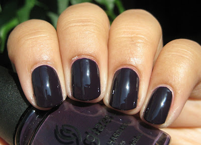

China Glaze VIII

An excellent basic eggplant creme. Smooth formula, dries quickly, completely solid in 2 coats.


Nails Inc. Kensington

Inky teal jelly, almost black. Works really well for water marbling, too!


New York Summer Hot Sky Blue

Another squishy blue jelly! This is great for jelly sandwiches, and also looks awesome under flakies.


And my favorite layering polishes:

Lynnderella Connect the Dots

Yep, it's on two of my lists. It's that good. With black and white glitter, there are so many layering possibilities!


Nails Inc. the Wyndham

This has the distinction of being my first flakie polish, and it remains my favorite. The green is so vivid, and there is a very evident blue shift.


Finger Paints Asylum

It has blue flakies!! I have been lusting after a flakie with just blue, but since I loathe Nfu Oh bottles and find Inglot to be too much of a hassle to get ahold of, this is as close as I will get for a while. It is lovely though.


Essie As Gold as it Gets

Sheer gold flecks. This is really delicate and pretty, especially over dusty, mid-toned colors.


Essie Shine of the Times

A basic orange-green flakie. It's very dense, so you don't need  much at all for a single manicure.


So, there you have it! My 30 favorites from last year. Thoughts? Do you like layering too, or do you find it troublesome?

Saturday, June 16, 2012

Jumping on the Gradient Bandwagon...(and SHXW Sun Kissed)

AKA one of the few instances of nail art you will probably ever see here, lol. I knew going into it that sponging would be difficult, but jeez :| Nail art is just not my thing. Luckily, after 3 or 4 rounds of sponging (and a thick coat of Gelous afterward), I got this result:


I used 1 coat of Essie Ole Caliente for the base, and as you can see, SHXW Sun Kissed is the other color. In retrospect, I should have sponged the orange onto the tips rather than the base, because I can see a few spots around my eponychia where Ole Caliente is still visible...I also had issues with flooding, because I put too much polish on the sponge. Cleanup was a nightmare, but I think that's kind of to be expected. I wound up just picking off the excess polish in the shower.

Despite the difficulties, I can see why gradients are so popular right now! All the flaws you can see in the macro shots aren't visible from a normal distance, so it looks really cool in person. Kinda reminds me of some sort of fruity summery drink.

I've already shown you Ole Caliente, but here's a photo of Sun Kissed that I took a while ago, under artificial light. It's actually a lot more yellow-toned than you'd think based on my photo of the gradient.


The formula is...not good. It's really thin and watery, and needs 4 coats for opacity. It is very bright and fun though, and the drying time wasn't as bad as I was expecting.

Thanks for looking and commenting, and enjoy your weekend!

Friday, June 1, 2012

Zoya Pinta + Finger Paints Asylum

Happy Friday, everyone! Today I've got for you a combination that I wore a few days ago.


Zoya Pinta is a "blurple" creme from the Dare half of Zoya's Truth or Dare collection from Fall 2009. It's supposedly a dupe for the long-discontinued OPI Sapphire in the Snow, which I wanted for a while. It's definitely on the purple side, but there's enough blue in it that I can't call it a plain purple creme either. In direct sunlight:


See what I mean? It's not blue, but it's not purple either...I'm not usually a fan of random portmanteaus like that (or needlessly shortened words, for that matter), but it's just...blurple. Indigo doesn't really seem like the right word for it either, lol. Either way, it's a great color!


There is a "but" though, and it's a pretty big but. Heh, butt. I'm so mature. Anyway, the formula. The formula is awful. I've read on NB that Pinta is a smooth one-coater for many people, but I think I got a bad bottle or something, because the formula is just terrible. I know a lot of people have issues with Zoya's formula in general, but I have 6 or 7 Zoya polishes, and this is the first one to give me trouble. The rest are wonderful.

Pinta feels sticky, is super prone to dragging and pooling in my eponychia, and takes ages to dry. And then by the time it dries, it bubbles. I don't get it. Usually, with cremes and jellies, I'll wait for each coat to dry completely before the next to keep things as smooth as possible, but Pinta streaked anyway, so it needs anywhere from 3-4 coats to become fully opaque. Mind you, I took these photos immediately after applying top coat, so it looks nice and smooth and glossy here....

My top coat couldn't fully disguise the flaws in my mani, so I added a thick coat of Finger Paints Asylum, which did the trick.


The blue flakes in Asylum actually show up pretty well over top of Pinta! Yay flakies. They fix everything. In direct sunlight:


It was pretty late in the afternoon, which is why the sunlight photos are so warm, but aside from the freakish yellow tinge to my hands, they're fairly accurate depictions of the polish.

Have a great weekend, and I hope that everyone in areas with a Tornado Watch stays safe! I spent most of the day in the basement while it stormed, haha.


Saturday, April 28, 2012

Essie Brooch the Subject + Shine of the Times

Essie Brooch the Subject was released as a part of Essie's Cocktail Bling collection for Winter 2011, and Shine of the Times is part of the Luxeffects collection released at the same time.


Brooch the Subject is a nude creme. I'm so clueless about nudes that I don't really know how to describe it, haha. This did photograph more yellow than it is IRL though.


It's almost opaque in 2 coats, but there were some uneven patches so it definitely needed the third. Just a note: I took these first two photos before the polish dried completely, and I didn't use any base coat, so there are some visible ridges. They did even out after drying though, as you can see here:


I've never actually tried a nude nail polish before, because I am so clueless about undertones and whatnot. When I decided I wanted a nude creme, I limited myself to just Essie polishes to make the decision a little easier, but still wound up spending several minutes holding different bottles up to the light and trying to figure out whether or not they might work for me. Eventually, I wound up just getting this one because I got too confused, lol. Luckily, I think this works? It doesn't match my skin completely, but it's great for a nice, clean look.

Since I can pretty much never leave cremes alone, I added a thin coat of Essie Shine of the Times. Some of these photos were taken before top coat, so some texture is visible, but it was perfectly smooth afterward.


It's a nice subtle look, but the flakies still show up nicely against the nude base.


There was practically no sun yesterday when I took these, but the sun came out for just a couple of minutes and I was able to take this shot. The flakies don't show up too well in direct sunlight, but on the bright side, I finally got an accurate depiction of the way Brooch the Subject looks against my skintone!


And here's the obligatory shot at an awkward angle to show the color shift:


Thanks for looking, and enjoy the rest of your weekend!

Tuesday, April 24, 2012

OPI The Show Must Go On

OPI The Show Must Go On was released with the Winter 2010 Burlesque collection. I couldn't care less about the movie, Cher, or Xtina (is she even relevant anymore?) but with that collection came some truly lovely shimmers. Aside from this, I picked up Tease-y Does It, which has become one of my favorites despite the horrendous, cringe-inducing name.


The Show Must Go On is an insanely vibrant pink-orange duochrome foil. It's almost opaque in 2 coats, but definitely needs the third one to make sure it's covered evenly. I am not a pink lover, but this is just awesome. The formula is pretty good. Nothing stellar, but definitely not bad either. Here it is in sunlight:


And in the shade:


The color shift doesn't show up too well in normal photos, so I took some at weird, awkward angles. It's a lot more visible in person.


It's so weird. I don't like pink, and I'm not big on orange either, yet I really like this color. Well played, OPI. Well played.

Thanks for looking!


Thursday, February 23, 2012

Essie Poor Li'l Rich Girl + Finger Paints Asylum

Essie Poor Li'l Rich Girl is a cool-toned red jelly from the 2004 Winter collection, Frozen Assets. This collection was released before Essie made the switch to a Big 3 Free formula, so Poor Li'l Rich Girl is chock full of toluene and whatever else Essie put in their formula before. It smells terrible, and I have to make sure the windows are open when I'm using this polish, but it's fantastic! The formula is very smooth, dries quickly, and since it is a jelly, it's very shiny even without top coat. This is 3 thin coats over 1 coat of Essie Fill the Gap. I made sure each coat was completely dry before I added the next, just in case.


There is still some visible nail line, but it's barely visible in most situations. I know reds aren't the most exciting, but this is a really really great one.


Since I love layering and flakies, I put 2 coats of Finger Paints Asylum over the Essie, and while I'm not too crazy about the result, I don't think it looks too bad either.


Maybe a warmer red base would look better under Asylum? I do like how the blue flakies pop against Poor Li'l Rich Girl though.


Unfortunately, I think the Finger Paints flakies are sold out in most areas at this point, but if you like flakies, you don't have any dupes in your stash, and you come across them, they're definitely worth getting. I only have 2, Asylum and Flashy, but I'm happy with them despite the relative sparseness of the flakes.

Thanks for looking!

Wednesday, February 1, 2012

Quirius Sunshine Energy + Lynnderella Connect the Dots

Quirius is a less well-known brand, and one that I don't have much experience with, but turns out they make killer neons! murkyDismal on MUA posted a photo of Sunshine Energy, and despite the fact that I don't like pink too much, I don't wear much orange, and I'm not big on neons, I really really liked the color. Luckily, it was at a nail supply not too far from my house, and it was pretty cheap. $2 or $3 if I recall correctly. It's so insanely bright!

I first showed you Sunshine Energy as a base for Connect the Dots in my Top 20 post, but here it is on its own. You have to be careful with application since it's a neon and neons are pretty prone to streaking, but this one isn't bad at all compared to some others. 3-4 coats.


It photographs more orange than it is in real life, but it's awesome either way. I also like the typical flat, matte neon finish. I think it goes well with a color this loud and vibrant.


I'm not really sure how, but Sunshine Energy made it into my Top 20! I didn't have photos of it on its own when I wrote the post, so I showed it to you as a base for Lynnderella Connect the Dots. This is that combination, with a matte topcoat:


Neon cremes and Connect the Dots are a match made in heaven.


It looks like there are flecks of white dust or something on the surface of my thumbnail, but that's actually the speckled white shimmer in Connect the Dots, and it doesn't actually look like dust in person.

Thanks for looking!


Friday, January 13, 2012

Franken Friday #2 + Finger Paints Asylum

Today's franken isn't a particularly interesting one, but it's a 1-coater and I'm quite fond of it all the same. The only problem is...I couldn't get it to photograph in such a way that it didn't look identical to the first one! It's a greyish blue, and it's very clearly blue in person, but every photo I took of the darn thing just looks grey.


Yeah.....it just looks grey. It's not, I promise! I added 3 coats of Finger Paints Asylum over top. Asylum, like Flashy, is super sparse...


A closer look at the flakies in Asylum:


Before I took it off, I decided to try it with a matte top coat, and I'm very happy with the result!


And a closeup of the flakies with matte top coat:


Thanks for looking!

Wednesday, January 4, 2012

Essence What Do U Think? + Essie As Gold as it Gets

Good morning! Today I have a not-so-premium polish to show you. Bonus points if you get the reference!

Essence What Do U Think? is one of the known dupes for Chanel Orange Fizz, and is the most easily accessible here in the US, since Ulta sells Essence Colour & Go polishes. The other dupe that I know of is Catrice I Scream Peach! but as far as I know, Catrice isn't available here.

I can safely say that between the formula and the brush, What Do U Think? is one of the worst polishes I've used in a long time. The formula is thick, chalky, and very streaky, so you need at least 4 coats before it will even out. And despite the fact that these polishes are marketed as quick-dry, it took a very long time to dry. Longer than normal polish, even, although that could also be attributed to the excessive number of coats required. I even wound up with bubbles on my pinky. Not cool.


Check out those bubbles. Cute. That said, this really is a nice color. Orange is pretty far out of my comfort zone, but I really like the color. It's soft and vibrant at the same time. In the bottle, there is some sparse golden shimmer, but that barely shows up on the nail. I was originally going to wear this on its own, but those bubbles were driving me nuts, so I layered a coat of Essie As Gold as it Gets on top. Here is the result:


Not only do the sheer golden flakies in As Gold as it Gets look awesome over a lighter base color, they even camouflaged the bubbles and other such flaws in my application! Have a closer look at the texture and shimmer of the Essie:


Thanks for looking!