Showing posts with label shimmer. Show all posts

Sunday, September 29, 2013

Revlon Divine

Whoops, I inadvertently disappeared again. But I am here to, for once, post about an LE in a somewhat-timely fashion! Revlon Divine is part of the Evening Opulence collection for Fall 2013, designed by Gucci Westman.

The collection includes another 3 colors: Rich (which looks just like Carbonite), Elusive (a black/teal glitter that looked AWESOME in the bottle, not so much in swatches), and Seductive (a deep purple jelly). I really wanted to like Elusive, especially since in the bottle, it looks like a teal version of Facets of Fuchsia, but nope. It dries matte, which isn't a big deal, but the base is so opaque that a lot of the glitter gets lost, and the result is just sort of lumpy. Top coat is definitely an improvement, but I think I'd rather franken something similar that would be a better fit to my preferences.

Anyway, Divine! Divine might look familiar to you, as it's quite similar to Germanicure by OPI and my all-time favorite, OPI Royal Rajah Ruby! Here it is in the shade:


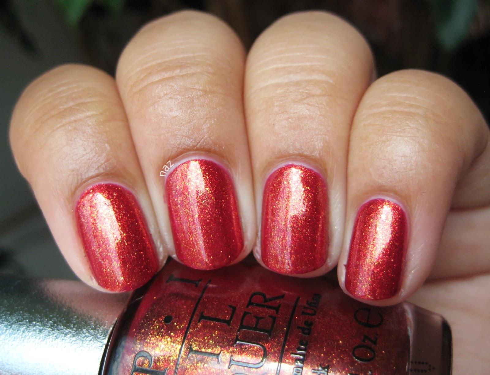
Dat shimmer! Here it is in the sun:


And another picture of the shimmer, because why not.


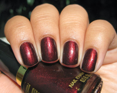
How great is that? I know, once again, not the most unique color on the planet, but I love it anyway. I probably won't have time to do a proper comparison to Royal Rajah Ruby, but I do have a swatch from last fall that I hadn't posted. So, for reference, RRR:


I think I can finally stop obsessing over backups, LOL.

On an entirely unrelated note, who else is preemptively freaking out in anticipation of Breaking Bad!? OMGGGGG. I don't think I've ever hated a fictional character quite as much as Walt. Maybe Schillinger. Or Adebisi. But Oz is chock full of unequivocally horrible people.

Have you tried Divine, or any of the other Gucci Westman colors? Were you as disappointed in Elusive as me?

Thanks for looking and commenting, and enjoy the rest of your weekend!

Friday, August 30, 2013

Butter London Victoriana

Butter London Victoriana was released in Fall 2010, along with Bumster, Marrow, and All Hail the Queen. Victoriana and All Hail the Queen have been getting a lot of love from polish addicts since their release, and while I had admired swatches, I didn't really get the hype. I still don't have any particular feelings about the latter, but the silvery shimmer of Victoriana sucked me in, and I finally caved.


I have to say, I am really impressed with the formula. Victoriana was almost perfect in one coat, but did need a second. I barely had to clean up this mani, and both the wear and drying time are great.


Actually, I bought this while I was still in a cast, and it was so easy to apply I wound up wearing this for quite a while. I can't remember whether or not I had used top coat when I took these photos, but I remember noting that Victoriana dried pretty glossy, which is nice. Here it is in the sun:


So pretty. You know by now that I love a dusty blue, and this is just great.


As far as I know, Victoriana is fairly unique. OPI I Have a Herring Problem and Zoya Skylar are similar, but the OPI and Zoya both have different colors of shimmer, and I think Victoriana's base has just a bit of teal in it that also distinguishes it from the others. Now that I think about it, I do own OPI I Have a Herring Problem, so I could have just compared the two myself. I'm lazy, but if you'd like me to do the comparison, let me know and I'll be happy to!

Have you tried Victoriana, or any of the other similar colors? Thoughts?

Thanks for looking and commenting, and have a great weekend!


Wednesday, August 7, 2013

Wet n Wild Under Your Spell + Comparison

Wet n Wild Under Your Spell is one of the Megalast colors. Truth be told, I have no clue whether it's core or LE, but it seems to have been released in early 2010. It was sitting in the rack at a local CVS, and since I had some Extrabucks, I figured, why not? Besides, I thought it might be a good, cheap alternative to my beloved OPI Royal Rajah Ruby. More on that later, but in the meantime, Under Your Spell. Here it is in the shade:


Since it's a vampy shimmer, same caveat applies: it's dark and my camera freaked out, you know the deal. The shimmer isn't super prominent in the shade, but it's certainly more visible than OPI Black Cherry Chutney. Now, take a look at it in the sun:


Muuuuch better. As you might be aware, the not-so-new-at-this-point Megalast polishes have biiiig brushes. They are big, and they are fluffy, but they aren't as bad as you might expect. It was thin and watery on the first coat, but I was pleased to find that it was solid in 3 coats. I figured I was going to have to layer it over black to reach opacity, but fortunately that isn't necessary!


Now, let's see how it compares to Royal Rajah Ruby. Royal Rajah Ruby is on my index and ring fingernails, and Under Your Spell is on the middle and pinky fingernails.


They do look quite similar! Royal Rajah Ruby has warmer, more prominent shimmer.


Okaaaay, to most people I guess they're pretty much the same. And it'll do as an alternative, but I have to admit I still like the OPI better.


Now the difference is a little clearer. It's not too obvious in this photo, but Royal Rajah Ruby has a reddish/brown base, whereas Under Your Spell is black-based. The OPI is also more opaque.

Thoughts? Are you as weird and picky about basic dark red shimmers as I am?

Thanks for looking and commenting, and I hope you're having a great week!

Monday, August 5, 2013

OPI Black Cherry Chutney

OPI Black Cherry Chutney is from OPI's Spring 2008 India collection. Most of the colors were quite boring to me, but the two vampy shades, for some reason, are freakin' awesome to me. OPI Royal Rajah Ruby, as you might possibly be aware, is my absolute favorite nail polish, and while Black Cherry Chutney isn't quite that awesome, it is pretty great in and of itself! In the shade, it looks like a vampy creme, and I tried to photograph it but it's so dark my camera had a bit of a freakout.


I'd say that's a pretty accurate depiction of how it looks in the shade, but it's so dark my camera freaked and decided to make my skin look super pale. I'm pretty sure my skin hasn't been that light since I was a year old, hahah. But, check it out in the sun!


Eeeeee. So pretty.


I am smitten with this shimmer. The formula wasn't bad, a 3-coater for me, but I think the brush was cut a little funny in this one because application was sort of tricky.


Being a vampy shimmer, OPI Black Cherry Chutney probably has a toooon of dupes. OPI Every Month Is Oktoberfest is similar, but cooler-toned, and Midnight in Moscow is warmer, so the opposite. I mean, there are many colors like this. This happens to be a pretty good one, but it's hardly groundbreaking, haha.

Have you tried Black Cherry Chutney, or any of the other India colors? Thoughts?

Thanks for looking and commenting, and have a great week!

Friday, August 2, 2013

OPI DS Indulgence

HAPPY FRIDAY! I don't know about you guys but I am SUPER stoked this Friday. Why? My presentations are over. They weren't formal presentations or anything, more like standing in front of my poster and presenting to whoever walked up and asked me about my project, but it went on for five hours. Also, my lower back and I learned the importance of supportive shoes. Oy. Anyway, I am so relieved, and it wasn't as bad as I had expected it to be. So let's end the week with one of my new favorites.

OPI DS Indulgence was one of two Designer Series colors released in Fall 2012. The other was Luxurious, a fiery orange foil that is quite pretty, but not really my thing. Indulgence, on the other hand, is perfect.


This is three thin coats, with no top coat. Application was excellent, and I didn't even have to clean up!


That gold shimmer is even more spectacular in the sun.


In case you couldn't tell, I'm really excited about this. More Top 20 material!

Zoya Kimmy and Zoya Reva struck me as similar, but they seem more foil-like, and Reva is more berry/pink. I do like the Zoya foils I've tried, but out of the three I'd go with Indulgence, personally. If you're in Europe, check out P2 Hot Berry! Like Kimmy, it is more of a foil than Indulgence, but the gold shimmer looks nice and visible.

Have you tried either of the two OPI Designer Series from last fall? What do you think?

Thanks for looking and commenting, and have a great weekend!

Monday, July 29, 2013

A-England Dragon

Aaaaand here is Dragon! Dragon is a fern-y green scattered holographic with the added bonus of some gold shimmer.


Well, the gold shimmer isn't exactly visible in the shade, but it'll come out in the sun.


Dragon was even in one coat, but I found that a second coat added depth.


One thing I should note was that Dragon's formula wasn't quite as good as Saint George. It had a slight tendency to get a little lumpy if you go over the same spot more than once, but a couple drops of thinner would probably fix that.


Yayyy, shimmer! Admittedly, I am not quite as stoked about this one as I was about Saint George, but to be fair, Saint George is pretty hard to beat.

Dragon reminds me a bit of La Femme Unica, but Unica is definitely more olive than Dragon. It's also more holo, and lacks the gold shimmer. Of the two, I'd definitely choose Dragon, personally!

Thanks for looking and commenting, and have a great week!

Saturday, July 27, 2013

A-England Saint George

Whoops! Apparently I forgot to finish writing this post before scheduling it...sorry if you've seen it already, haha.

A-England Saint George was released with the Legends collection in early 2012. It was A-England's second collection, and to me, a HUGE improvement from the first! I think they were probably establishing themselves with some more basic colors with the Mythicals, which makes sense, but none of the colors were particularly interesting to me...and then they did this. I remember looking at Legends swatches from Ommorphia and Scrangie and thinking OMFG I NEED SOME OF THESE, except somehow it still took me over a year to cave and buy them. I am so glad I finally did, because these are just beautiful. You'll see Dragon on Monday, but in the meantime, here is my favorite:


As you can see, Saint George is a scattered holographic teal. There's no distinct rainbow to be found, but that prismatic shimmer imparts a TON of depth. I hope you don't mind the mini pic-spam I've got for you today, I'm just really excited (and hella late to the party)!


The great thing about scattered holos is that they don't look nearly as boring in the shade as linear holos do. Of course, they reach their full awesomeness in bright, direct sunlight, but this is still pretty freaking fantastic.


*dies*

Saint George has a thick, super opaque formula. It's almost perfect in 1 coat, but I did need a second. And I would also recommend keeping thinner on hand. I will probably add a couple drops before using it again. It wasn't unmanageable in its original state though, just a bit thick for my liking. Here's another photo...because I can!


Top 20 material for sure. And now I am even more excited about Briarwood! It looks sorta like the scattered holo version of OPI Royal Rajah Ruby, and you KNOW I will be all over that.

Now, as for similar polishes...I think this is pretty unique. L.A. Girl recently released a collection of scattered holos that included a teal, but the finish is very different, more like the Milani holographics in a jelly base. There's also Glitter Gal Lizard Belly, which is not only much greener but a linear holo. Basically, if you like this, I would absolutely recommend it! It's a really special color in my collection, I think.

Thanks for looking and commenting, and enjoy your weekend!!

Wednesday, July 24, 2013

Reswatch: Essence Walk on the Wild Side

Essence Walk on the Wild Side was released last summer. I posted it then, along with three of the other Colour & Go polishes, but I wore it again recently and am once again smitten. Plus, I'm hoping my nails and photos have improved somewhat in the last year ;)


Greeeeeen. Shimmery green. The shimmer isn't super sparkly but it's so cool! Walk on the Wild Side is as fabulous as I remember. My assessment of the formula hasn't changed either- almost perfect in 2 coats but still requiring a third for full opacity.


Now I want to wear the others again.

Did you wind up like me, getting all excited about these when they were released, only to forget about them until a year later?

Thanks for looking and commenting, and I hope you're having a great week!

Friday, July 19, 2013

Contrary Polish Desert Fruit + Comparison

Today I've got for you the last of my Contrary Polish stash. Desert Fruit is one that I have worn several times, but just couldn't get decent photographs of until recently. It's a purple, so no surprise there...I'm very surprised to see myself getting excited about a purple, though. That hasn't happened in a while!

Desert Fruit was a stand-alone release from Fall 2012, and not part of any collection. It's a dusty, warm purple with fiery red shimmer, and like my other Contrary Polishes, dries a little satin-y so top coat would be a good idea.


I have to say, Desert Fruit has the best formula out of the Contraries I own. It was solid in 2 coats. And look at that shimmer- it's even clearly visible in the shade! Let's take a look at it in the sun:


That red shimmer is really cool!

Desert Fruit reminds me of Dior Shadow and OPI Peel Me a Gobi Grape, though Shadow looks like it has slightly less shimmer, and Peel Me a Gobi Grape has roughly the same amount of shimmer but it looks a bit more coppery than red. They're all very pretty in their own right, but I don't think either the Dior or the OPI are available anymore, whereas Desert Fruit is probably in stock at Llarowe right now.

I also thought of L.A. Girl Intoxicate, which I have compared to Desert Fruit here.


Now, they are quite similar, especially in the shade, but there are a few subtle differences. Intoxicate is darker, and while it didn't really translate well in pictures, it also has a yellow-gold shimmer. Intoxicate's purple base is also a more saturated purple, whereas Desert Fruit is kind of dusty. They're both nice colors, but Desert Fruit has a much better formula. Intoxicate needed 3 coats, and I noticed that the drying time was quite slow.

Have you tried Desert Fruit? Thoughts?

Thanks for looking and commenting, and have a great weekend!

Wednesday, July 17, 2013

China Glaze Running In Circles

China Glaze Running in Circles is part of the Cirque du Soleil collection from Winter 2012. Personally, I don't care for Cirque du Soleil, or for most of the colors in the collection for that matter...but this one is a different story. Running in Circles is a beautiful, complex grassy green glass-fleck.


I can't even. It's so sparkly, and has so much depth! It's a wee bit sheer, a 3-coater, but I think the finish completely makes up for it.


Running in Circles, like Don't Mess With OPI, stained a blue, but it was nowhere near as bad. Plus, the slight blue staining worked quite nicely for my yellowed nails >.>

There's a P2 polish called Green Palm Tree that I think is similar to Running in Circles, but it is lighter and has this super-cool gold shimmer running through it. The only problem is, P2 is a European brand, but if I could get ahold of it at the same price I paid for this, I would choose the P2. Don't get me wrong, they're both lovely, and I am happy with this one! But I am a sucker for some nice gold shimmer.

Have you tried Running in Circles, or any of the other Cirque du Soleil colors? Thoughts?

Thanks for looking and commenting, and I hope you're having a great week!

Friday, July 12, 2013

OPI Glacier Bay Blues

OPI Glacier Bay Blues was released in 2004 with the Canada collection. In the bottle, it's a beautiful blurple duochrome that shifts teal and green. On the nail.......


Boring, blurple-leaning blue shimmer. I mean, it's a nice enough color with lots of depth, it's just really not what I was hoping for. This isn't my thing at all.


I was able to coax out a bit of the duochrome...


Better. But it's not often that you'll see it like this. Oh, and did I mention that this is 6 coats? Yeah. It's that watery and sheer. At 3 coats, it was opaque down the middle, but it was still noticeably sheer on the sides. 

This is pretty similar to Nubar Peacock Feathers, so if you can get your hands on that I would defenitely advise choosing it over Glacier Bay Blues. Peacock Feathers looks to be a bit more purple. but more duochrome as well.

Have you tried Glacier Bay Blues? Were you as disappointed in it as I am?

Thanks for looking and commenting, and have a great weekend!

Wednesday, July 10, 2013

Revlon Chic + Essie As Gold As It Gets

Today I've got for you a layering combo that is a little different, but I'm pretty pleased with how it looks. 2 coats of Revlon Chic, and 1 thin coat of Essie As Gold As It Gets. Chic has a perfect formula, nearly opaque in 1 coat, and very smooth.


I know people tend to layer As Gold As It Gets over darker colors so the gold stands out more, but I personally like it best over mid-toned colors, especially dusty ones like Chic.


No sunlight pics today, because the sun just washed out all the shimmer, so I figured they would be sort of pointless.

I need to dig through my stash for more murky cremes to layer this over. I've definitely got Revlon Guest List and SHCSM Greige Gardens in mind...maybe I'll also try it over a light grey...

What are your favorite bases for As Gold As It Gets?

Thanks for looking and commenting, and I hope you're having a great week!

Friday, July 5, 2013

Contrary Polish Ain't No Sunshine

Today I have another lovely Contrary Polish to show you. Ain't No Sunshine is from the Love Lyrics collection that was released for this past Valentine's Day. Ain't No Sunshine is perfect in 3 thin coats, and needs a layer of top coat to bring out the awesomeness.


The shimmer is so delicate and pretty. Like my other Contraries, it's subtle but not hidden.


Great formula, too. Very smooth, and the brush was great as usual.


It reminds me a lot of Illamasqua Raindrops, but I prefer this. Raindrops is supposedly quite sheer, and based on swatches the shimmer looks a bit too subtle for my liking. Ain't No Sunshine is darker and bluer, of course, but I think that helps ensure that the shimmer is visible. Needless to say, I am no longer interested in Raindrops. I also want to note that this wore very well on me- after 4 days I had the tiniest hints of tipwear, but that's it. Me encanta. These grey-blues get me, every time.

Have you tried any of the Love Lyrics collection? Thoughts?

Thanks for looking and commenting, and have a great weekend!

Monday, July 1, 2013

Zoya Blaze

Hah, after a month straight of an indie, it almost feels a little odd to post a commercial polish! But this one is an absolute stunner. Zoya Blaze is from the Ornate collection, Zoya's offering for this past holiday season. The Ornate collection had the distinction of containing Zoya's first holos: Storm, Aurora, and Blaze. Predictably enough, I'm not crazy about the purple, but I was surprised to find that not only did  I not care for the black, I fell for the red/pink/berry/whatever you want to call it!


Prior to this, I had been having some trouble with my manis. Lots of disappointment. Unlike Eclectic, Valerie, and Kelly, Blaze was just delightful to work with. Smooth formula, with a good drying time. I found that Blaze was even in 2 coats, but a third added depth. Here it is in the sun:


I did apply top coat before taking these pictures, but I want to point out that it was quite shiny alone! You could forego the topcoat if you were so inclined. It's weird and unexpected how much I like this color. When I wore it, I even did my pedicure to match. That almost never happens.


Oh, and for the record, the holographic bits are a lot more rainbow-y in person. More camera problems...

So, my 3 year-old niece has picked up on my ever-changing nail color, and always grabs my hands to inspect them when she sees me. She seemed to really like this one, because when she looked at it she grinned at me and said, "Naz! Pretty color!!"

I can't think of any dupes for this. I know Picture Polish recently released Shocked, but that is a lighter and brighter pink. There's Ozotic Pro 621, which is definitely red with slightly orange-y undertones, Picture Polish Monroe, which is a vampy red. Not to mention, 621 and Monroe both have different kinds of scattered holo finishes! They are all pretty colors in their own right, but I'd still choose Blaze over them.

Have you tried Blaze, or any of the other Zoya Ornate colors? Thoughts?

Wednesday, June 19, 2013

Crowstoes Merope

Happy Wednesday! Today I have for you the last of the Pleiades. Merope is a strange and awesome color, sort of a bruised blue-burgundy with a pink shift. Does that make any sense? Who knows. I do know that it's super cool, and can be worn either alone or over black.


I wouldn't really recommend wearing it alone since it was a 4-coater for me, but if that doesn't bother you, it does look pretty nice!


Nice, strong duochrome. Me gusta.


And here it is over black. This is another good one to layer over black. 1 coat was perfect!


And the duochrome:


Interestingly enough, it was a little less duochrome over black, like Taygete. The black base makes the blue shimmer pop though, so it's not a huge issue to me.


That pink still does show up though!

Now, if you looked at this and thought of Orly Galaxy Girl, fantastic. That's exactly where my mind went too, and once again I actually have the polish to compare! I hope you're looking forward to my comparisons because I've got several.

Have you tried Merope? Thoughts?

Thanks for looking and commenting, and I hope you're having a great week!