Showing posts with label comparison. Show all posts

Wednesday, August 7, 2013

Wet n Wild Under Your Spell + Comparison

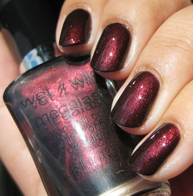
Wet n Wild Under Your Spell is one of the Megalast colors. Truth be told, I have no clue whether it's core or LE, but it seems to have been released in early 2010. It was sitting in the rack at a local CVS, and since I had some Extrabucks, I figured, why not? Besides, I thought it might be a good, cheap alternative to my beloved OPI Royal Rajah Ruby. More on that later, but in the meantime, Under Your Spell. Here it is in the shade:


Since it's a vampy shimmer, same caveat applies: it's dark and my camera freaked out, you know the deal. The shimmer isn't super prominent in the shade, but it's certainly more visible than OPI Black Cherry Chutney. Now, take a look at it in the sun:


Muuuuch better. As you might be aware, the not-so-new-at-this-point Megalast polishes have biiiig brushes. They are big, and they are fluffy, but they aren't as bad as you might expect. It was thin and watery on the first coat, but I was pleased to find that it was solid in 3 coats. I figured I was going to have to layer it over black to reach opacity, but fortunately that isn't necessary!


Now, let's see how it compares to Royal Rajah Ruby. Royal Rajah Ruby is on my index and ring fingernails, and Under Your Spell is on the middle and pinky fingernails.


They do look quite similar! Royal Rajah Ruby has warmer, more prominent shimmer.


Okaaaay, to most people I guess they're pretty much the same. And it'll do as an alternative, but I have to admit I still like the OPI better.


Now the difference is a little clearer. It's not too obvious in this photo, but Royal Rajah Ruby has a reddish/brown base, whereas Under Your Spell is black-based. The OPI is also more opaque.

Thoughts? Are you as weird and picky about basic dark red shimmers as I am?

Thanks for looking and commenting, and I hope you're having a great week!

Wednesday, June 19, 2013

Crowstoes Pleiades Comparisons!

Two posts in one day?? Yep.

I'm going to start off with Electra and Alcyone, the two blue-purple duochromes. They are photographed as I swatched them, with 1 coat over American Apparel Passport Blue and Zoya Pinta, respectively. Alcyone is on my index and ring fingernails, and Electra is on my middle and pinky fingernails.


Electra is more turquoise/teal, and Alcyone is distinctly more purple. The duochrome:


Of course, since Alcyone is more purple-leaning, the purple shift is stronger in Alcyone than Electra. Overall, while they're both quite pretty, you probably don't need both. But depending on what you're looking for, they are both lovely! Oh, and I was going to compare these two to Orly Lunar Eclipse...here is a bottle comparison to explain why:


They look pretty similar in the bottle, right? On the nail, not at all. I guess if you're not a blue lover they're close enough, but to me, Lunar Eclipse is totally different. Lunar Eclipse has a bold cobalt jelly base and barely has any duochrome compared to the Pleiades, so I wound up not doing comparison swatches on the nail.

Next up is Maia versus Zoya Valerie. Valerie is on my index and ring fingernails, and Maia is on my middle and pinky fingernails.


Valerie is much darker, as you can see. It's also more opaque, but not duochrome at all.

I also compared Maia to Violet Quartz. Violet Quartz is on my index and ring fingernails, and Maia is on my middle and pinky fingernails.


These were pretty similar, actually! Violet Quartz is darker and has finer shimmer, and I think it's a bit warmer. But Violet Quartz is also discontinued...Maia is a great alternative.


Maia is a lot more duochrome than Violet Quartz, though.

Here are Merope and Orly Galaxy Girl. Galaxy Girl is on my index and ring fingernails, and Merope is on my middle and pinky fingernails. Both polishes were swatched alone, without a black base.


Galaxy Girl is darker, jellier, and has larger, sparser flecks of blue shimmer.


Merope is more duochrome, but Galaxy Girl isn't anything to scoff at, either! I don't think Galaxy Girl is available anymore, unless your Ulta still has some Cosmic FX left over from Fall 2011.

And last but not least, a comparison that wound up being a bit of an ombré: (L-R) Celaeno, Color Club Wild & Willing, Asterope, and Claire's Poison Apple.


They're all fairly duochrome and quite pretty, but definitely distinct colors.

So, that's it for the Pleiades. I hope you enjoyed them, and on Friday I'm going to get started with the glitters!

Thanks for looking and commenting!

Friday, May 17, 2013

Contrary Polish Purple Smoke + Comparison

Happy Friday!! I am especially stoked today. I just finished my last final (Spanish), and I feel great about it. Today I've got for you a Contrary Polish that isn't necessarily as exciting as the others I've posted so far, but is still quite awesome.

Contrary Polish Purple Smoke is one of the original six colors. When I first saw it, I thought, eh, it's close enough to Paradoxal, Perplex, etc. and if you're not a fan of those greyish/taupe-y/purple colors, it probably is! However, I love them, and am quite pleased with Purple Smoke. It's opaque in 3 thin coats. In the shade:


Like the other Contraries, Purple Smoke is a subtle shimmer, but not at all hidden. Purple Smoke dries pretty matte, so you'll definitely need top coat. In the sun:


The shimmer in Purple Smoke isn't nearly as contrasting as some of the other colors, but I think it's lovely nonetheless. I've also compared it to Revlon Perplex and Barry M Dusky Mauve (an exact dupe for Chanel Paradoxal). I know, Perplex and Dusky Mauve are pretty close, but I chose to compare it with both because to me, Perplex is definitely more purple, and Dusky Mauve is more brown.

So, first up, Purple Smoke vs. Perplex. 2 coats of Perplex on the index and ring fingernails, with top coat.


As you can see, Perplex is darker, warmer, and more purple.

And Purple Smoke vs. Dusky Mauve. 2 coats of Dusky Mauve on the index and ring fingernails, plus top coat.


Like Perplex, Dusky Mauve is warmer and more purple than Purple Smoke, but Dusky Mauve is also a lot more taupe or brown-leaning. Purple Smoke looks blueish in comparison.

All three of these polishes have great formulas, so I'd recommend any of them. Out of these, Perplex will definitely be the easiest to obtain. It has been renamed Naughty, and is now core. Full-sized Contrary Polishes are available on Llarowe, Femme Fatale, and Shoppe Eclectico, but on Fridays, you can also buy minis straight from the Contrary Polish blog. For those of you in the US, Dusky Mauve will be the most troublesome to obtain- I bought mine on Ebay. Harlow and Co. sold Barry M at one point, but I don't see them on the site anymore. You can order directly from Barry M, but I know of someone who had quite a bit of trouble with them, and wouldn't recommend it.

Have you tried any of these? What did you think? Are you as much of a sucker for greyish purples as I seem to be?

Thanks for looking and commenting, and have a great weekend!

Wednesday, November 28, 2012

Revlon After Party + Comparison

Hey y'all! Today I'm going to show you Revlon After Party. It's from the same collection as Guest List, which I posted last week. After Party is fabulous. It's a dusty teal creme. Here it is in the shade:


And in the sun:


Unfortunately, it has the exact same formula as Guest List, meaning that you will probably have to let the coats dry completely in between to prevent streaking, and it will most likely need 2-3 coats to even out anyway. Oh, and ignore the TOP SPEED labels because I'm pretty sure these take longer to dry than regular polish. 

BUT. I do quite like this color, as evidenced by the fact that I've also got Revlon Chic...let's compare the two, shall we? 2 coats of Chic versus 3 coats of After Party, with top coat. In the shade:


And in the sun:


They're not thaaaaat similar right? RIGHT??? Oh well, it's ok, they are both great colors.

On a side note, the end of the semester is quickly approaching and it's going to be killer, so I'm going to go on hiatus for a bit. I will hopefully resume posting towards the end of December.

Anyway, talk to me about dusty blues! What are your favorites? Do you have Chic or After Party? Do you have a weakness for dusty blues like me?

Thanks for looking and commenting, and I hope you're having a great week!

Tuesday, October 30, 2012

Verity Midnight Green + Comparison

Verity Midnight Green is a squishy, super glossy dark green jelly. It's opaque in 4 coats, and I had no issues with bubbling. In indirect light:


So squishy!! The formula was excellent too. It was thin, but workable, and didn't get all up in my cuticles or anything. In the sun:


LOVE. Now, as you may have realized, I've posted quite a few greens. Perhaps you're wondering how they compare? Even if you weren't, I went ahead and compared them anyway. Out of my greens, I found that the closest (in the bottle) are Verity Aqua Blue, Illamasqua Rampage, and NYC Flat Iron Green. Bottle shots:


Aqua Blue is pretty clearly different from the others, so I decided to leave it out when doing my comparison swatches. And you can see that my bottle of Rampage has been pretty well loved, haha. In the shade, Rampage, Midnight Green, and Flat Iron Green look pretty similar. Rampage is a bit lighter, but not by much. Midnight Green and Flat Iron Green look pretty much identical.


In a brighter lighting situation, the differences become more apparent (or maybe it's just my green addiction that becomes more apparent.....).


Rampage is definitely lighter and brighter now, but Flat Iron Green and Midnight Green still look the same. The sun was not cooperating when I took the comparison photos, and my artificial light source wasn't cutting it, but there are indeed minute differences between Midnight Green and Flat Iron Green. I mentioned this when I posted Flat Iron Green, but that one's a murkier, swampier green. Midnight Green is a pure forest green. 

I'm probably going to wind up purging Flat Iron Green, because it's not really that good, and Rampage & Midnight Green are so much better. I'm glad I've got Midnight Green though, because it's so much cheaper than Rampage! $1 versus $14....Needless to say, I no longer want NARS Zulu!

Thoughts? Feelings? Do you even like dark greens? Are there any colors that you automatically gravitate towards even though you know you've already got similar ones?

Thanks for looking and commenting, and have a great week!

Monday, July 2, 2012

Milani Dress Maker + Comparison


Milani Dress Maker was released with the Haute Value collection from Fall 2010, and is known to be a dupe of Chanel Jade. I believe it's also similar to Dior Waterlily, minus the revolting rose scent of course.

Unfortunately, Dress Maker is really sheer. This is 5 coats, with top coat, in the shade.


I rather like Dress Maker. It's got enough yellow in it that it works with my skintone, but it's not so yellow that it borders on lime green, which I thoroughly despise. I'm also quite a fan of the green shimmer. It's subtle, but in this case, I think it works. Unfortunately, you can still see a bit of VNL at 5 coats...not good. In direct sunlight:


I also compared it to my 2 other mint greens, Sinful Colors Open Seas and Sinful Colors Mint Apple. I used 3 coats of each in the following photos.


Obviously, they have very different finishes. Open Seas is a creme, Dress Maker has small particles of subtle green shimmer, and Mint Apple has larger particles of silver and yellow/gold shimmer. Dress Maker is the most yellow-toned of the three, and I think Open Seas is the most blue-toned. It almost looks aqua next to Dress Maker. 

Thanks for looking and commenting!

Thursday, June 14, 2012

Barry M Dusky Mauve + Revlon Perplex

Today I've got for you two alternatives to the lovely, but rather expensive Chanel Paradoxal.

According to Lacquerized, Barry M Dusky Mauve is pretty much an exact dupe for Paradoxal. The formula and application are both great, and Dusky Mauve is fully opaque in 2 coats.


And here is Revlon Perplex. Same thing, 2 coats for opacity, great application.


As similar as they do look, they're not completely the same. They are very close though, and unless you want a backup or just really like these sorts of colors, you probably don't need both.


As you can see, Perplex's shimmer is more prominent, and it also has more purple in its base. Dusky Mauve is more brownish. I know I'm a little late to the Paradoxal bandwagon/party but this type of color is one of my favorites when I need something that's less bright or in-your-face.

 Barry M is a UK drugstore brand, and I bought my bottle of Dusky Mauve on Ebay. If you'd rather not take your chances with Ebay, the etailer Harlow & Co. carries some Barry M, although I'm not entirely sure whether they've got Dusky Mauve. Revlon Perplex has been renamed Naughty, and is part of the new core line that includes Chic and Whimsical, so that one should be easily found at drugstores and such.

Thanks for looking and commenting! 

Sunday, January 22, 2012

Hard Candy Envy + Comparison

Hard Candy Envy is a blackened emerald shimmer. In some lights it does look black, but the green shimmer is vibrant and almost always visible. It took 2 coats for opacity.


This was actually one of the colors that started my polish addiction a little over a year ago. I love green, I love dark colors, and I love shimmers, so this is pretty much perfect for me.


I read somewhere that Envy is a dupe for Deborah Lippmann Don't Tell Mama, so I thought I'd swatch the Lippmann next time I went to Nordstrom. Here they are side by side, 2 coats of Envy vs. 2 coats of Don't Tell Mama:


Not quite dupes, but very close. Honestly, the differences you can see in this photo aren't all that visible in person. I kept forgetting which fingers had which polish on, but you can see here that the Lippmann is more of a dark teal shimmer than green, and it looks like there's a bit more blue in its base color. Envy just has a black base.

Thanks for looking!

Friday, January 20, 2012

China Glaze GR8 + Franken Friday #3

For today's franken, I started with China Glaze GR8, a yellow/gold linear holo. The formula was smooth and GR8 was opaque in two coats.


The only problem? The color...not so flattering. It's like mustard, and it's weird. No me gusta. So I dumped out a little bit and replaced it with a blue jelly, Ruby Kisses Regaled Out Blue. I'm much happier with the result! Still opaque in 2 coats, but now it's a sea green linear holo. Here it is in direct sunlight:


It refused to photograph accurately though, so here's a color-accurate photo I took in the shade.


It's a weird photo and I'm not sure what's going on with my skintone, but it at least shows you what color the polish actually is! I tried photographing it in my usual lighting setup but that was even less accurate than the sunlight photos, as you can see...


It looks a lot like DV8 there. Here's a comparison between the franken, DV8, and L8R G8R under artifial light:


In direct sunlight:


As you can see, DV8 is much bluer than my franken. It doesn't even look teal in comparison, whereas L8R G8R practically looks silver rather than the celadon green that it actually is.

Thanks for looking!