Showing posts with label sinful colors. Show all posts

Wednesday, November 14, 2012

Sinful Colors Slate

Sinful Colors Slate was released with the Destination America collection in Fall 2011. It is an interesting gray shimmer that is almost opaque in 2 coats, but does need a third. No complaints about formula. Once again, there was no sunlight when I took these photos, so you get artificial light photos today.


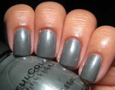
As you can see, the base is a medium grey, with slight blue undertones, and the shimmer is silvery. Unfortunately, the shimmer does border on frosty, as you can see when the light is diffused.


Yeah....not so good....it doesn't usually look this frosty, but since it does sometimes I figured I'd show you anyway. One interesting I noticed was that in addition to the silver shimmer, there are dark grey specks.


They're not obvious or visible when you're just looking at your hand, rather than through a camera lens, but the dark flecks do add a bit of interest and depth to an otherwise boring polish. 

I don't think there are any dupes of this polish, at least, not any that I am familiar with, but all the same, I am not too thrilled about Slate. It's not bad, but it's not that interesting to me. Plus, I don't think medium greys are very flattering on me. I love light greys like Dorien Grey, and super dark greys, but the medium ones are kind of blah. Oh well, they can't all be winners, right?

Have you tried Slate? How do you feel about these types of greys?

Thanks for looking and commenting, and I hope you're having a great week!

Monday, November 5, 2012

My First Water Marble!

I've always admired water marbles on other people, but got it in my head that they are totally impossible so I shouldn't even bother trying anyway. But then my mom and niece saw one and were like "NAZ YOU NEED TO TRY THIS IT LOOKS SUPER COOL." So I watched a few Youtube videos, tried marbling a few individual nails until I felt I had kinda started to get the hang of it, and then attempted a full mani. Here's my left hand:


As you can see, I messed up the ring fingernail, and I feel like the designs turned out too simple for my liking. But I started with the pinky nail on this hand, so I think I improved a bit by the time I finished my right hand.


I marbled with Sinful Colors Open Seas and $OPI Slushied, over a base of OPI Ridge Filler, which toned them down quite a bit.

Aaaaaand now I am hooked on water marbling. I have another one to show you later on, but in the meantime, talk to me about water marbling! Have you ever tried it? How did it go? What are your favorite color combinations?

Thanks for looking and commenting, and have a great week!

Monday, July 2, 2012

Milani Dress Maker + Comparison


Milani Dress Maker was released with the Haute Value collection from Fall 2010, and is known to be a dupe of Chanel Jade. I believe it's also similar to Dior Waterlily, minus the revolting rose scent of course.

Unfortunately, Dress Maker is really sheer. This is 5 coats, with top coat, in the shade.


I rather like Dress Maker. It's got enough yellow in it that it works with my skintone, but it's not so yellow that it borders on lime green, which I thoroughly despise. I'm also quite a fan of the green shimmer. It's subtle, but in this case, I think it works. Unfortunately, you can still see a bit of VNL at 5 coats...not good. In direct sunlight:


I also compared it to my 2 other mint greens, Sinful Colors Open Seas and Sinful Colors Mint Apple. I used 3 coats of each in the following photos.


Obviously, they have very different finishes. Open Seas is a creme, Dress Maker has small particles of subtle green shimmer, and Mint Apple has larger particles of silver and yellow/gold shimmer. Dress Maker is the most yellow-toned of the three, and I think Open Seas is the most blue-toned. It almost looks aqua next to Dress Maker. 

Thanks for looking and commenting!

Sunday, April 22, 2012

Sinful Colors Open Seas + Essie As Gold As It Gets

Sinful Colors Open Seas is a polish that I showed you back in December, but since my original photo isn't accurate and my nails were in pretty bad shape at the time, I figured I'd reswatch for this post. 3 thin coats, no top coat, artificial light.


The formula is thin but smooth, and it levels itself out nicely. I just can't seem to leave cremes alone though, so I decided to put a thin coat of Essie As Gold as it Gets on top.


I had my doubts about mint green and gold together, but I actually rather like the result. It's subtle, but really cool.


I know the Essie stands out more against dark colors, but I like it much better over lighter ones like this, or Essence What Do U Think.

Thanks for looking!

Wednesday, April 11, 2012

Sinful Colors Cinderella

Sinful Colors Cinderella is a milky light blue with pink flecks of shimmer. Usually with colors like this, the shimmer kind of disappears in the base and never looks as prominent as it does in the bottle. Not the case here!


Shimmerrrrr. It didn't really show up on camera, but trust me, it's a lot more prominent in person. I usually don't like normal pastels on me, because something about my skintone and the combination of light and bright...it just doesn't really work. I actually really liked this though!


It's so unique compared to all the other light blues out there! The only problem? The formula. Oh goodness, that formula. What you see here is five coats, no top coat. My base was a coat of Sally Hansen Miracle Nail Thickener, which is clear. A ridge-filling base coat probably would have helped, but regardless, five coats. And you can still see some of the nail line on my pinky and index finger. I let each coat dry completely to avoid bubbling, so as you can imagine, this manicure took a while. The formula was pretty thick, but manageable, and I like the Sinful Colors brush so it wasn't too bad. Five coats though...if you have a light blue like Illamasqua Caress or Sally Hansen Barracuda, I'd recommend using those as a base. 


That shimmer though! I guess that's the tradeoff. Sheer base, prominent shimmer. I'm not a huge fan of blue and pink together but it works really well here. A closer look:


Thanks for looking!

Thursday, February 16, 2012

Sinful Colors Mint Apple

Good evening! Sorry I've been MIA for the last few weeks; the spring semester started recently and I'm still not quite used to my schedule. But today, I come with an awesome drugstore polish! I usually have trouble with pastels and minty colors against my skintone, but Mint Apple has enough yellow in it, and it's dark enough that it works. The formula is a little thin, so it needed 3 coats, but it's very smooth and I barely needed to clean up this mani. Here it is in artificial light, and as always, you can click on the photos to enlarge:


In natural light, it's a little more blue-toned, but not by a whole lot. In direct sunlight:


The shimmer is primarily silver, but you can see bits of yellow or gold shimmer! It's fantastic. In the shade, Mint Apple turns much bluer, but still not to the point that my hands turn into lobster claws.


It almost reminds me of a shimmery version of Essie Turquoise and Caicos in the shade. Such a fantastic color! And it's only $1.99 most of the time. Right now, Sinful Colors are 99 cents at Walgreens. I think that deal lasts for the rest of the week, but don't quote me on that.

Thanks for looking!

Tuesday, December 20, 2011

Nails Inc. Kensington + Sinful Colors Nail Junkie

The semester's finally over, which means I'm back! It's been a while since I last posted, and I figured I'd come back with an new favorite layered with an old favorite.

Kensington is the base color that came paired with the Wyndham. I still don't have a swatch of Kensington on its own...I'll have to do that at some point. I paired 3 coats of Kensington with 1 coat of Nail Junkie, and I have to admit I'm really happy with the result! I don't have top coat on in either of the photos in this post, so there is still some texture, but take my word for it when I say that it was perfectly smooth after top coat.


The multicolored glitters in Nail Junkie really stand out against a dark base like Kensington. There are small hexes and tiny squares, as you can see here:


Thanks for looking!

Thursday, December 1, 2011

Sinful Colors Open Seas, plus some layering!

Sinful Colors is great. They've been ripping off OPI collections lately, which I guess isn't cool for OPI, but it's great for us! It means we can get $2 dupes of some of the colors. In the spring, OPI released their Pirates of the Caribbean collection, and soon afterward, Sinful came out with their Adventure Island collection.

Open Seas is a jade creme intended to dupe OPI Mermaid's Tears. It came pretty close, but not quite. Mermaid's Tears is a bit more blue-toned, and Open Seas has more yellow. That's a good thing for me though, since Mermaid's Tears is a very weird color for my skintone. Open Seas looks MUCH better. It has an interesting formula though. It's thin, and needs to thicken up a bit before it becomes easy to apply. The first time I wore it, it took 3 coats, but the next time it only took 2. Here is 2 coats of Open Seas on its own (advance apologies for the dry hands! the cold has not been kind):


Of course, since I can never leave a creme alone, both times I've worn this I layered with it. The first time I wore it, I put L.A. Girls Crowd Surfing (aka Love & Beauty Green) on top.


I tried wearing this combination matte too, and it looks even cooler that way! I had some proper photos of this combination, but my hands are so horribly dry that I'll spare you all those photos.


The second time I wore this, I layered Nails Inc. the Wyndham on top! I'm very fond of this combination too. 2 coats of the Wyndham over Open Seas:


For some reason, I forgot to take photos of this while it was glossy, but I like it better matte anyway.