Showing posts with label opi. Show all posts

Monday, August 26, 2013

OPI Miami Beet

Miami Beet is from the Spring 2009 South Beach collection. It's a vibrant, glossy magenta creme.


Still weird. But still a nice color, and still a nice pedicure.


I have to say, the formula on this one is really nice. It's thin and smooth, like a jelly, and it's perfect in 2 coats.


Just look at that shine! No top coat. I am currently rocking this on my toenails, and it looks fantastic.

Have you tried Miami Beet? Thoughts? What kind of colors do you like for your pedicures?

Thanks for looking and commenting, and have a great week!

Wednesday, August 7, 2013

Wet n Wild Under Your Spell + Comparison

Wet n Wild Under Your Spell is one of the Megalast colors. Truth be told, I have no clue whether it's core or LE, but it seems to have been released in early 2010. It was sitting in the rack at a local CVS, and since I had some Extrabucks, I figured, why not? Besides, I thought it might be a good, cheap alternative to my beloved OPI Royal Rajah Ruby. More on that later, but in the meantime, Under Your Spell. Here it is in the shade:


Since it's a vampy shimmer, same caveat applies: it's dark and my camera freaked out, you know the deal. The shimmer isn't super prominent in the shade, but it's certainly more visible than OPI Black Cherry Chutney. Now, take a look at it in the sun:


Muuuuch better. As you might be aware, the not-so-new-at-this-point Megalast polishes have biiiig brushes. They are big, and they are fluffy, but they aren't as bad as you might expect. It was thin and watery on the first coat, but I was pleased to find that it was solid in 3 coats. I figured I was going to have to layer it over black to reach opacity, but fortunately that isn't necessary!


Now, let's see how it compares to Royal Rajah Ruby. Royal Rajah Ruby is on my index and ring fingernails, and Under Your Spell is on the middle and pinky fingernails.


They do look quite similar! Royal Rajah Ruby has warmer, more prominent shimmer.


Okaaaay, to most people I guess they're pretty much the same. And it'll do as an alternative, but I have to admit I still like the OPI better.


Now the difference is a little clearer. It's not too obvious in this photo, but Royal Rajah Ruby has a reddish/brown base, whereas Under Your Spell is black-based. The OPI is also more opaque.

Thoughts? Are you as weird and picky about basic dark red shimmers as I am?

Thanks for looking and commenting, and I hope you're having a great week!

Monday, August 5, 2013

OPI Black Cherry Chutney

OPI Black Cherry Chutney is from OPI's Spring 2008 India collection. Most of the colors were quite boring to me, but the two vampy shades, for some reason, are freakin' awesome to me. OPI Royal Rajah Ruby, as you might possibly be aware, is my absolute favorite nail polish, and while Black Cherry Chutney isn't quite that awesome, it is pretty great in and of itself! In the shade, it looks like a vampy creme, and I tried to photograph it but it's so dark my camera had a bit of a freakout.


I'd say that's a pretty accurate depiction of how it looks in the shade, but it's so dark my camera freaked and decided to make my skin look super pale. I'm pretty sure my skin hasn't been that light since I was a year old, hahah. But, check it out in the sun!


Eeeeee. So pretty.


I am smitten with this shimmer. The formula wasn't bad, a 3-coater for me, but I think the brush was cut a little funny in this one because application was sort of tricky.


Being a vampy shimmer, OPI Black Cherry Chutney probably has a toooon of dupes. OPI Every Month Is Oktoberfest is similar, but cooler-toned, and Midnight in Moscow is warmer, so the opposite. I mean, there are many colors like this. This happens to be a pretty good one, but it's hardly groundbreaking, haha.

Have you tried Black Cherry Chutney, or any of the other India colors? Thoughts?

Thanks for looking and commenting, and have a great week!

Friday, August 2, 2013

OPI DS Indulgence

HAPPY FRIDAY! I don't know about you guys but I am SUPER stoked this Friday. Why? My presentations are over. They weren't formal presentations or anything, more like standing in front of my poster and presenting to whoever walked up and asked me about my project, but it went on for five hours. Also, my lower back and I learned the importance of supportive shoes. Oy. Anyway, I am so relieved, and it wasn't as bad as I had expected it to be. So let's end the week with one of my new favorites.

OPI DS Indulgence was one of two Designer Series colors released in Fall 2012. The other was Luxurious, a fiery orange foil that is quite pretty, but not really my thing. Indulgence, on the other hand, is perfect.


This is three thin coats, with no top coat. Application was excellent, and I didn't even have to clean up!


That gold shimmer is even more spectacular in the sun.


In case you couldn't tell, I'm really excited about this. More Top 20 material!

Zoya Kimmy and Zoya Reva struck me as similar, but they seem more foil-like, and Reva is more berry/pink. I do like the Zoya foils I've tried, but out of the three I'd go with Indulgence, personally. If you're in Europe, check out P2 Hot Berry! Like Kimmy, it is more of a foil than Indulgence, but the gold shimmer looks nice and visible.

Have you tried either of the two OPI Designer Series from last fall? What do you think?

Thanks for looking and commenting, and have a great weekend!

Monday, July 15, 2013

Don't Mess With OPI

Don't Mess With OPI is a grassy green from OPI's Spring 2011 Texas collection. It's so strange, I clearly remember getting this and being excited about it and wearing it, but it also feels like 2011 was so long ago. :O Don't Mess With OPI is solid in 2 coats.


The formula is thin, but smooth.


There's just one problem with this polish...it stains blue when you remove. Skin, nails, eeeeeeeeeeeeeverything it touches turns blue, and it's a PITA to get out. The staining keeps me from using this too often, honestly.

Now, there are TONS of grassy green cremes out there. The first one that comes to mind is Essie Pretty Edgy, which I have! It is definitely warmer than the OPI, but the formula is not as good. It's thick and streaky, but the color is very nice and it doesn't stain blue.

Have you tried Don't Mess With OPI, or any of the other Texas colors? Thoughts?

Thanks for looking and commenting, and have a great week!

Friday, July 12, 2013

OPI Glacier Bay Blues

OPI Glacier Bay Blues was released in 2004 with the Canada collection. In the bottle, it's a beautiful blurple duochrome that shifts teal and green. On the nail.......


Boring, blurple-leaning blue shimmer. I mean, it's a nice enough color with lots of depth, it's just really not what I was hoping for. This isn't my thing at all.


I was able to coax out a bit of the duochrome...


Better. But it's not often that you'll see it like this. Oh, and did I mention that this is 6 coats? Yeah. It's that watery and sheer. At 3 coats, it was opaque down the middle, but it was still noticeably sheer on the sides. 

This is pretty similar to Nubar Peacock Feathers, so if you can get your hands on that I would defenitely advise choosing it over Glacier Bay Blues. Peacock Feathers looks to be a bit more purple. but more duochrome as well.

Have you tried Glacier Bay Blues? Were you as disappointed in it as I am?

Thanks for looking and commenting, and have a great weekend!

Wednesday, May 22, 2013

OPI Metallic 4 Life

OPI Metallic 4 Life was released with the Nicki Minaj collection in early 2012. It's a black jelly with tons of silver glitter. Too much glitter, in my opinion. I used 2 very thin coats over a black base and probably should have stuck with one.


Meh. It's not a bad color, just not my thing. It seems sort of messy-looking...


I figured I'd try it matte, since I clearly don't like this as is...


Nope. Should've left it glossy. Oh well, they can't all be winners. I do love the idea of silver glitter in a black jelly base, so I'm debating decanting some of it and adding clear and a little bit of black. The formula wasn't bad, and frankly I didn't want to wear this long enough to comment on wear, so I do want to clarify that it's not an issue of quality or anything. I just think the glitter:base ratio is way off for my tastes. On Friday, I'll have something much much better to show you. :) And one of these days I'll learn to keep track of what day it is, lol!

Nicole by OPI Luke of the Draw looks pretty much the same, if not slightly more dense. But given that they're both OPI products, they're probably just rebottled versions of each other.

Have you tried Metallic 4 Life? How did you feel about it?

Thanks for looking and commenting, and I hope you're having a great week!

Friday, March 1, 2013

OPI Don't Touch My Tutu + Le Metier de Beaute Moon's Glow

Whoa, long title. As soon as I put on OPI Don't Touch My Tutu, my mom walked in, saw my manicure, and excitedly declared that it would be a perfect base for one of her recent acquisitions: Le Metier de Beaute Moon's Glow. Turns out they actually sell decently-sized  bottles of polish now. Anyway, I think she was right! I used one thin coat of Moon's Glow over 3 coats of Don't Touch My Tutu, which was in turn layered over 2 coats of Essie Fill the Gap.


*gasp* A frost. I know. It's so not my style. And yet, I kinda like it? It's a nice change, if nothing else. 


It kind of reminds me of those satin-y pillowcases. Or pearls. Or fairy princess nails, as my buddy Dana phrased it.


Depressingly enough, I think the Le Metier de Beaute brush is probably my new favorite. Y AN EXPENSIVE TASTE? Womp womp. It's so good though. Sort of like the OPI Pro-Wide, but a bit shorter and slimmer, so application is much much easier.

As for dupes, CND Gold Shimmer is the closest color I can think of, but the CND is a lot less frosty, and of course, cheaper, so you will probably prefer that. 

I was actually eyeing another Le Metier polish somewhat recently: Dream Maker. It's this crazy vivid blurple. Really glossy creme, and so cool. But I wimped out, and I also figured it would be a huge pain in the ass to photograph. If you like purple/blurple/indigo/whatever you want to call it, you need to check it out.

What do you think? Have you ever found a frost you actually kinda liked (and are willing to admit it)? Have you tried any Le Metier de Beaute polishes?

Thanks for looking and commenting, and have a great weekend!


Wednesday, February 27, 2013

OPI Don't Touch My Tutu

OPI Don't Touch My Tutu is from the NYC Ballet collection, OPI's Soft Shade offering for 2012. Despite being comprised almost entirely of sheers, the Ballets were quite popular amongst nail addicts. The one non-sheer polish was a lovely silver and white glitter called Pirouette My Whistle, which for some reason I've still not been able to find! The vast majority of those sheers aren't my cup of tea, but I've been lusting after a nice white jelly, so I decided to try this.

And I don't know about you all, but my nails are crazy stained. I mean, I have this ~gorgeous~ yellow gradient thing goin' on at my tips, so I figured I couldn't pull off a sheer. WRONG. Check this out.


So fresh, so clean. And I gotta tell y'all, the formula on this was perfect. Zero cleanup, effortless application. I used 3 coats of Don't Touch My Tutu over 2 coats of Essie Fill the Gap. No top coat on in these photos because I layered over it, and you will be seeing the result on Friday. Here it is in the sun:


You can see some of the weirdness in my nails when there's direct sunlight on 'em, but luckily that is not the usual lighting condition.


Being a white jelly, Don't Touch My Tutu has tons of possible alternatives out there. OPI Funny Bunny is one, but based off of swatches that seems like a more stark white. Definitely more opaque, too. Essie Marshmallow and Essie Waltz are also pretty standard white jellies, but I've heard that Marshmallow has a nightmarish formula. 


I kind of want another one of these sheers now. You Callin' Me A Lyre, probably. The beige one looks too close to the white, and I would probably look dead in the lilac and grey ones, sadly...

Have you tried any of the OPI Ballets? What did you think?

Thanks for looking and commenting, and I hope you're having a great week!

Friday, February 15, 2013

OPI Did You 'Ear About Van Gogh?

Yaaaay it's Friday! Unfortunately, my exam schedule is starting to get into high gear, so we'll see whether or not I can keep up with posting this semester...I might switch to posting on weekends instead, lol. I dunno. We'll see. I'll definitely peace out for a bit once finals approach.

Anyway, today I have for you my new favorite neutral! OPI Did You 'Ear About Van Gogh? is from the Holland Collection for Spring 2012. It's a really strange choice for me, but I. Love. It. 2 thin coats, no top coat.


As you can see, it is a sandy beige with some strong grey tones. I'll admit, this was a total impulse buy, and I kind of expected to hate it as I started my manicure, but luckily I experienced the opposite outcome. In the sun:


Now, let's talk about the formula. It is fantastic. I had no trouble with the Pro-Wide. At the first coat, it was kinda runny and watery so it flooded a bit, but I quickly got the hang of it. It's actually passable at a single coat, if you were so inclined! This will definitely be one of my go-to colors when I'm in a hurry. It dries nice and quick.

Honestly, I suck at comparing neutrals, but Zoya Farah is apparently a dupe. It's interesting, Zoya and OPI apparently had quite a bit of overlap last spring...but if you're anything like me, Zoya cremes do not work so well for you, so I would recommend this over Farah.

Have you tried OPI Did You Ear About Van Gogh? Or was there perhaps another color that you expected to hate, but wound up loving?

Thanks for looking and commenting, and have a great weekend!

Friday, January 25, 2013

Reswatch: William Tell Me About OPI

Well, this isn't really a reswatch per se, but I wore William Tell Me About OPI again recently and wanted to share, since it's been a year and two days since I posted it the first time.


Awesome color, awesome formula. Thanks for looking and commenting, and have a great weekend!

Monday, January 7, 2013

Grey/Magenta Water Marble

So, I was so stoked about my first water marble that I just had to do another one! This time I chose OPI Miami Beet and SHCSM Dorien Grey. Grey and pink is a fun color combo, and I'm pretty happy with how this turned out. I started with a base of 2 coats of Dorien Grey. My left hand, in the shade:


Unfortunately, the design smeared a bit when I put on top coat. :( I should have waited longer. In the sun:


And here's my right hand! I decided not to top coat this one because I was happier with these designs (especially the pinky) and I didn't want to risk smearing them. Sorry about the wonky nail shapes, and I don't know what those little bumps on my middle fingernail are. Oh well.


I had fewer translucent patches of Miami Beet on this hand. One of these days I'll figure out how to get rid of those altogether.

Thoughts? Feelings?

Thanks for looking and commenting, and I hope you had a great New Year's!

Wednesday, January 2, 2013

Top 30 of 2012! (part 1)

So, about a year ago I showed you my all-time favorites. I was going to do it again on the same day, but obviously that didn't happen because I am lame. I was also going to show you how my all-time favorites have changed in the last year, but I don't think they've changed a whole lot, so instead I will show you three lists over the next three days: my ten favorite polishes released this year, my ten favorite indies, and my ten favorites for layering (both base colors and layering polishes).

Several of them, I have not yet blogged about, so you'll be getting a sneak peek of some upcoming posts. And there are a few polishes for which I've not even taken photos, so you'll get a few bottle photos here and there. So, let's get started!

OPI Did You Ear About Van Gogh?

This year, I tried nude cremes! I'm still overwhelmed by all the combinations of hue, undertone, etc. but this one kinda works! It's greyish and cool-toned, but I think it has enough yellow in it that it sort of works. Regardless of my skintone weirdness, this is a great color with a great formula.


Revlon Urban

LOVE. Shiny, squishy dark blue creme with slight purple undertones. Great formula.


Essie Penny Talk

I've told you of my weakness for coppers, and this pretty much epitomizes it. One of the worst formulas I've ever worked with, but I can't resist the color! I'm even willing to forgive some brushstrokes for it.


Illamasqua Charisma

As you probably know, I'm not a pink fan. But this dark berry has some reddish undertones, and that shimmer. I just love it. Great pedicure color, too.


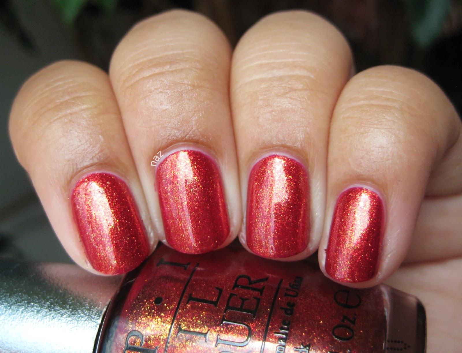
OPI I Have a Herring Problem

This is definitely one of OPI's better names, and one of their better colors too. Despite the sheerness, I love the finish and color, and the application is great.


Essie Ole Caliente

Coral is not really my thing but this is so pretty. It's reddish enough that I don't feel that weird wearing it, and Ole Caliente makes for an awesome summery pedicure.


Deborah Lippmann Cleopatra in New York

I'm not sure how she does it, but Deborah Lippmann really nails the balance of base color to glitter. The black base is opaque, but the gold still shines through, and the end result has so much depth. Plus, you can't go wrong with black and gold. (cue Sam Sparro playing in the background)


Essence Walk on the Wild Side

Really, I could have put all four of the new Colour & Go's on this list, but since I only left space for one, I chose this. Formula could be better, but the finish is great.


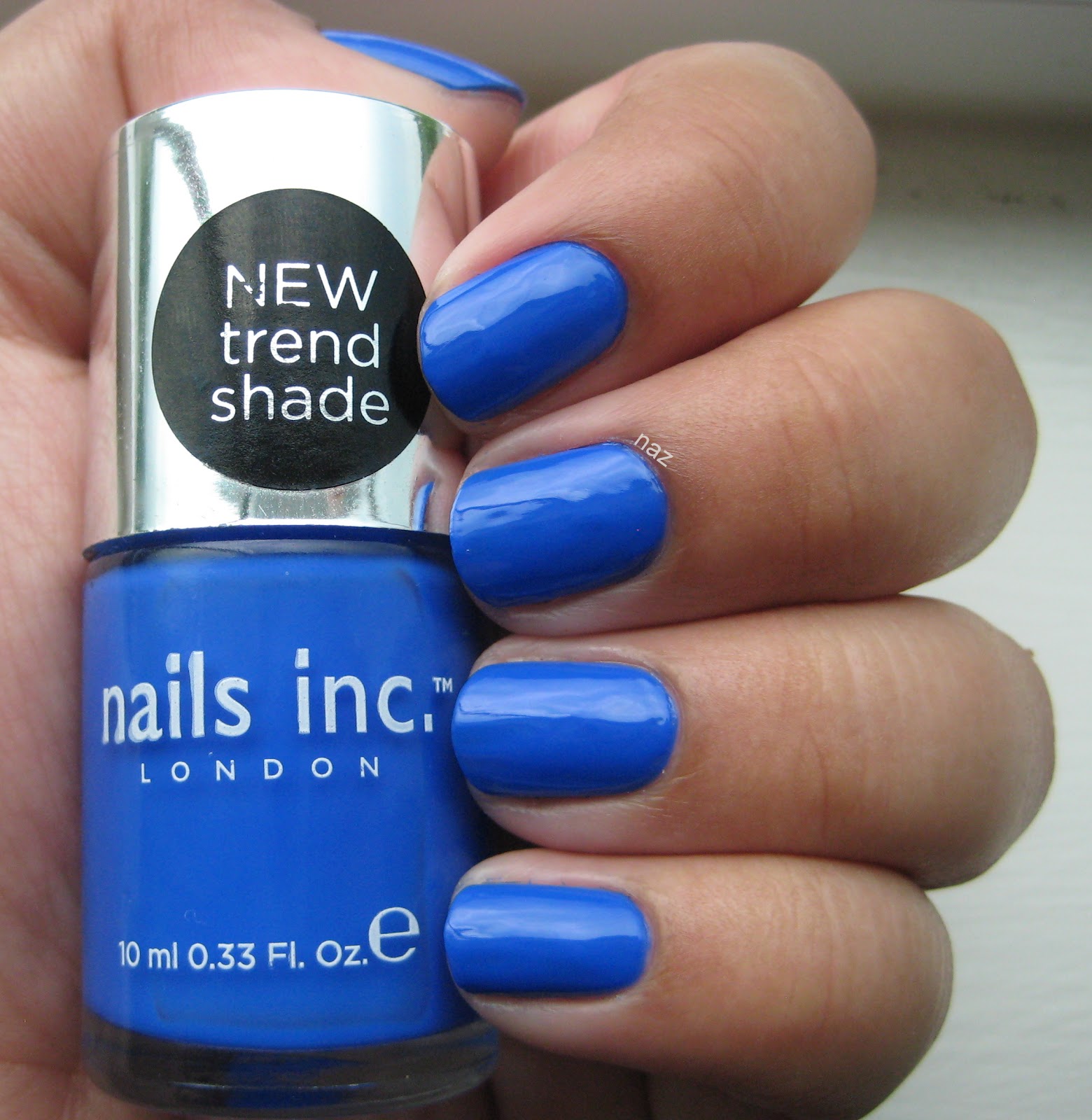
Nails Inc. Baker Street

I bet no one was expecting this. /sarcasm
Seriously though, how can you resist such a bold blue?


Revlon Guest List

In addition to nude cremes, I also tried an olive green for the first time this year. The formula is less than stellar, but I really like this.


Thoughts? Do we have any mainstream/mass-produced favorites in common? Tell me about yours!

Thanks for looking and commenting, and I hope you're having a great week! 

Monday, December 31, 2012

OPI Rose Petals

OPI Rose Petals was released with the 2005 Soft Shades collection. It's a mauve-y, pinkish nude sheer that needs 4 coats for opacity. I borrowed this from my roommate, and I'm quite glad I did so instead of buying this, because it is just...not good.


See what I mean? It's too cool, and waaaaay too pink for me. The formula is fine, pretty standard for a semi-sheer polish, but this is not a flattering color. In the sun:


A little bit better now, but still. Bleh. So, there you have it. If you're tan, warm, and yellow-toned, stay awaaaaay.

Have you tried Rose Petals? Thoughts? Feelings?

Thanks for looking and commenting, and have a great week!

Friday, October 5, 2012

Some Random Catch-Up Spam

Soooooo. I thought I got into a bit of a groove with the posting, and then exams started. I also wound up with a sinus infection (that is just starting to go away, after 2-3 weeks), and an impacted wisdom tooth, as well as a cavity on the molar right next to the impacted wisdom tooth, so I've been having fun, LOL. I haven't really painted my nails much lately, but I post from a backlog of photos, so it's really a matter of working up the motivation to write up a post.

Here's some "Sorry-I've-Been-So-Unmotivated" spam. This will be a fairly long post.

Wet n Wild On a Trip in the sunlight. FYI, this is...not accurate. On a Trip is warmer and dustier, but it looks periwinkle in my photos. Do not believe them. Someday I'll figure out how to accurately photograph this sucker. Good formula though. Thin, but smooth. 3 coats.


Got bored of it pretty quickly, so I slapped on a coat of NYC Starry Silver Glitter. Not really feeling it. I think On a Trip is too dark of a base color, because the silver is too prominent for my liking. I should have used Connect the Dots instead.


Next up, Borghese Stellare Notte. Is it just me, or does this thing take FOREVER to dry? I didn't have any bubbling, but this took a loooooong time. 2 coats of nail polish should not need an hour and a half of dry time.


Despite the long drying time (and the crazy paddle brush), the formula was good, and there is a definite color shift, which was very difficult to capture on camera. It's really cool though. In some lights, it's a dark shimmery green, and it looks straight-up plum in other lighting situations.

Next, OPI Miami Beet. Not one of my favorite colors for manicures, as I feel that bright pinks are very weird on my hands, but it looks awesome on toes. Oh, and I decided to try out square/squoval nails for a while. You'll see my nail shape change quite a bit over the next few weeks. 3 coats, plus top coat.


Great formula, but as you can see, Miami Beet is more of a jelly-ish creme, which means that in direct light you can still see VNL. It's not at all visible otherwise though.

And last but not least, China Glaze Glittering Garland. It's dark green, and full of shimmery flecks, so obviously, I love it! 2 coats for opacity. I tried getting a macro shot to give you a better look at the shimmer, but it just wasn't happening that day. As always, you can click on my photos to get a closer look.


Thanks for looking and commenting, and I hope you've all been doing well! Happy Friday! I'm going back to bed.