Showing posts with label white. Show all posts

Friday, June 21, 2013

Crowstoes Bunny Slope

Happy Friday! Today I have the first of four Crowstoes glitters for you. Bunny Slope is one of Crowstoes' first colors, and is a unique blend of matte white glitter and a few other glitters I can't quite put my finger on.

DISCLOSURE: Bunny Slope was sent to me by Crowstoes for my honest review.

There are glints of iridescence here and there, which is really cool! I swatched Bunny Slope alone and over OPI Don't Touch My Tutu, and I have to say, I really would not recommend the first way, LOL.


This is four coats alone. It sort of looks like I used loose glitter, which is a cool effect, but I have pretty much zero experience with this kind of formula, so application was tricky. The formula was very thick, but I've read that Crowstoes uses uncut suspension base, so after testing it one nail I went ahead and thinned it to my liking.


You can see a bit of the iridescent glitter, but unfortunately you can also see I had a hard time getting an even surface, even with thinning and a coat of Gelous. Luckily, the solution is really simple and I wish I had just started with this in the first place! I used 1-2 coats over 3 coats of OPI Don't Touch My Tutu.


I didn't get full coverage with this round of swatching, but looking at this combination in person, the white from the OPI does a nice job of filling in the gaps, and the result is a super cool, twinkling white.


There are also a few holographic bits in there! You can see a bit of it in the bottle, but unfortunately my camera, once again, had trouble picking it up. This will hopefully be the last time I have to tell you that, LOL. I feel bad that I have to keep saying "IT'S TOTALLY THERE TRUST ME" but yeah, bear with me D: In my attempts to capture some of these Crows properly, my dad let me use is fancy Nikon camera, which is a D3000 or something? I don't remember the exact model number but is it fancy. Anyway, I had even more trouble with that one.

I can't think of anything similar to Bunny Slope, so if it's something that catches your eye I would definitely recommend it, but don't expect this to apply like a Milani One Coat Glitter! Keep thinner on hand and be patient. That last part, I am not so good at, but I think this is worth the trouble.

DISCLOSURE: Bunny Slope was sent to me by Crowstoes for my honest review.

Have you tried Bunny Slope? Thoughts? Do you have any tips for application?

Thanks for looking and commenting, and have a great weekend!

Friday, March 1, 2013

OPI Don't Touch My Tutu + Le Metier de Beaute Moon's Glow

Whoa, long title. As soon as I put on OPI Don't Touch My Tutu, my mom walked in, saw my manicure, and excitedly declared that it would be a perfect base for one of her recent acquisitions: Le Metier de Beaute Moon's Glow. Turns out they actually sell decently-sized  bottles of polish now. Anyway, I think she was right! I used one thin coat of Moon's Glow over 3 coats of Don't Touch My Tutu, which was in turn layered over 2 coats of Essie Fill the Gap.


*gasp* A frost. I know. It's so not my style. And yet, I kinda like it? It's a nice change, if nothing else. 


It kind of reminds me of those satin-y pillowcases. Or pearls. Or fairy princess nails, as my buddy Dana phrased it.


Depressingly enough, I think the Le Metier de Beaute brush is probably my new favorite. Y AN EXPENSIVE TASTE? Womp womp. It's so good though. Sort of like the OPI Pro-Wide, but a bit shorter and slimmer, so application is much much easier.

As for dupes, CND Gold Shimmer is the closest color I can think of, but the CND is a lot less frosty, and of course, cheaper, so you will probably prefer that. 

I was actually eyeing another Le Metier polish somewhat recently: Dream Maker. It's this crazy vivid blurple. Really glossy creme, and so cool. But I wimped out, and I also figured it would be a huge pain in the ass to photograph. If you like purple/blurple/indigo/whatever you want to call it, you need to check it out.

What do you think? Have you ever found a frost you actually kinda liked (and are willing to admit it)? Have you tried any Le Metier de Beaute polishes?

Thanks for looking and commenting, and have a great weekend!


Wednesday, February 27, 2013

OPI Don't Touch My Tutu

OPI Don't Touch My Tutu is from the NYC Ballet collection, OPI's Soft Shade offering for 2012. Despite being comprised almost entirely of sheers, the Ballets were quite popular amongst nail addicts. The one non-sheer polish was a lovely silver and white glitter called Pirouette My Whistle, which for some reason I've still not been able to find! The vast majority of those sheers aren't my cup of tea, but I've been lusting after a nice white jelly, so I decided to try this.

And I don't know about you all, but my nails are crazy stained. I mean, I have this ~gorgeous~ yellow gradient thing goin' on at my tips, so I figured I couldn't pull off a sheer. WRONG. Check this out.


So fresh, so clean. And I gotta tell y'all, the formula on this was perfect. Zero cleanup, effortless application. I used 3 coats of Don't Touch My Tutu over 2 coats of Essie Fill the Gap. No top coat on in these photos because I layered over it, and you will be seeing the result on Friday. Here it is in the sun:


You can see some of the weirdness in my nails when there's direct sunlight on 'em, but luckily that is not the usual lighting condition.


Being a white jelly, Don't Touch My Tutu has tons of possible alternatives out there. OPI Funny Bunny is one, but based off of swatches that seems like a more stark white. Definitely more opaque, too. Essie Marshmallow and Essie Waltz are also pretty standard white jellies, but I've heard that Marshmallow has a nightmarish formula. 


I kind of want another one of these sheers now. You Callin' Me A Lyre, probably. The beige one looks too close to the white, and I would probably look dead in the lilac and grey ones, sadly...

Have you tried any of the OPI Ballets? What did you think?

Thanks for looking and commenting, and I hope you're having a great week!

Wednesday, February 6, 2013

SHCSM Greige Gardens + Lynnderella Connect the Dots

SHCSM Greige Gardens is a relatively new core color. I don't know details of the release, but I started seeing it in stores last spring. I love these types of greige/purple-y colors, but I always worry about how they'd look against my skintone, so I never bought any, but I recently found Greige Gardens on clearance at Target, and decided to cave. I'm glad I did, because it is lovely.


This is 4 coats, without top coat. It dries glossy, and the formula is smooth, but it's a lot more sheer than I think a creme should be. 4 coats for a creme is a bit much. I'm hoping this will go the way of Dorien Grey and improve with time, because I really like this color.


Then I decided to top it with 2 coats of Lynnderella Connect the Dots, and one coat of Gelous. I am in love with this combination.


YAY, square glitter! Those black squares are my favorite part of Connect the Dots, aside from the gigantic black hexes. I know there are tons of alternatives and approximations of Connect the Dots out there, and lots of drama associated with all this, but I still think this one is the nicest. Even with the bar glitter. Can't believe I'm saying this, but I think the bar glitter fits in really nicely with the other glitters, without reminding me of bacilli or beard trimmings.

It's also worth noting that I've now had this polish for roughly a year and a half, and I've had no issues with sinking glitter, or warping/bleeding/melting, so I'm very pleased in that regard. I totally understand why extensive testing isn't practical for indies, but it is still one of my concerns as a consumer, so I thought I'd throw that in there. If only Lynnderellas still cost $12...

Now, let's talk about similar polishes. For Greige Gardens, three polishes come to mind: Parlez Vous OPI?, A-England Guinevere, and China Glaze Below Deck. Parlez Vous OPI is warmer, more purple, and discontinued; Guinevere is more purple, although I have a hard time judging warmth vs. coolness because of variations between swatches; and Below Deck is darker, warmer, and more purple. Below Deck is definitely the most different of the four.

Connect the Dots, as I've previously mentioned, has a buttload of cousins. I vaguely considered listing them, but ain't nobody got time for that. Except for Chalkboard Nails. Her black & white glitter mega post is awesome and really helpful, so I'll just direct you over there, and you can see for yourself.

Greige seems to be one of those love it or hate it sorts of colors- how do you feel about it? Have you tried Greige Gardens, or Connect the Dots? Or perhaps any of the other black and white glitters? Thoughts?

Thanks for looking and commenting, and I hope you're having a great week!

Friday, January 18, 2013

China Glaze White Cap

China Glaze White Cap was released with the Anchors Away collection for Spring 2011. It consists of yellow-gold flecks in a sheer white base. It works well as a layering polish, especially over Sea Spray (from the same collection), but I wanted to try to replicate the look in the bottle. I started with 3 coats of OPI Ridge Filler, and used 3 coats of White Cap on top. In the shade:


In the sun:


Totally not my usual kind of look, but I dig it.

For some reason, when I started writing this post, I figured, "Oh, White Cap probably has tons of dupes out there." Except now I can't really think of any? CND Jade Sparkle has a very similar look, but is in a clear base, so it's more versatile. Aside from that...I got nothing.

Thoughts? Have you tried White Cap, or anything similar? Did you like it? What kinds of base colors would you pair with it?

Thanks for looking and commenting, and have a great weekend!

Sunday, August 5, 2012

Revlon Chic + Lynnderella Connect the Dots

So, I've probably told you many many times of my love for Chic and Connect the Dots, but for some reason it didn't occur to me to wear them together until now. WHY DID IT TAKE ME SO LONG? I'VE HAD BOTH THESE COLORS FOR MONTHS.

This is two coats of Chic. I used one sort-of coat of Connect the Dots over top of it, but I kinda dabbed it on rather than applying a "proper" coat.


It might be because I haven't pulled out Connect the Dots in a while, but I did have a bit of trouble placing the glitter, and I had to fish for the big square pieces. I was able to get one of those giant hexes though, so I am pleased with that! They usually don't lay flat, but if you give it 3 or 4 minutes to set, and then gently press it down with a fingertip or something, it stays, and doesn't snag on everything.

Of course, I had to try wearing this matte. Under artificial light:


So cool. And almost entirely smooth! No Gelous required.

As I've mentioned before, Chic is part of Revlon's core lineup, so that shouldn't be hard to find at all. Connect the Dots (and all other Lynns, for that matter) is another story. I believe they're currently being sold on Ebay for $20 each.

There are a TON of indie alternatives to Connect the Dots if you'd rather not buy the Lynnderella (or if you'd just rather not pay $20 for a polish that was once sold for $12)......... Chalkboard Nails put together a fantastic comparison.

Thanks for looking and commenting, and have a great week!

Monday, June 4, 2012

Revlon Runway Pearl

Every so often, Revlon puts out "trendy" colors in separate displays, like Perplex (later rereleased under the name Naughty) and Carbonite. This spring, we have Runway Pearl, but I have to admit I'm a little confused. Perplex and Carbonite are pretty clear knockoffs of Chanel Paradoxal and Chanel Graphite, respectively, and were released not long after the Chanels, but I can't tell what Runway Pearl is supposed to approximate. It looks sort of like Chanel Intermezzo, but Intermezzo is a frosty mess, and has pink, subtle shimmer. Either way, Runway Pearl is fantastic. In the shade:


As you can see, Revlon Runway Pearl is a soft white with contrasting shimmer. In the shade, the shimmer looks pinkish, but in direct light it's closer to red. I was worried that the shimmer would disappear in the shade or just not show up at all *cough*RBL*cough*, but that is not the case! By the time I got around to taking these photos, it was too late in the afternoon to get decent sunlight shots, so I used artificial light instead. Skyward Sword is so distracting :'D


The artificial light gives it a slightly yellowish/ivory cast which isn't there in person, but this was more for the purposes of depicting the shimmer. It looks so freaking cool! Wherever the light hits it, it gets this glowy pink sheen.


Shimmerrrrrr.

As far as formula goes, Runway Pearl wasn't too bad. I didn't apply any top coat before taking these photos, and I used 4 thin coats of Runway Pearl over 1 thin coat of Essie Fill the Gap for opacity. Yeah, it's a little sheer, but I think that's a good thing in this case, because otherwise it might have been too stark a white for me to pull off. This way, it's still a soft, but clean white. I did notice some patching near the cuticle end of my nails after the second coat, but I just let all subsequent coats dry completely, and it evened itself out. As usual, the brush was great, no complaints there.

Thanks for looking and commenting!

Monday, May 28, 2012

Nails Inc. Baker Street + Lynnderella Connect the Dots

Baker Street is a fairly new offering from Nails Inc. I first heard about it when photos of Beyonce wearing it started floating around the intarwebs, and even though I don't really care for her, the nail color piqued my interest. 


A lot of times, when I've spent a lot of time drooling over a particular color, I'm left rather disappointed once I actually get my hands on it. Not the case with Baker Street! It's quite a chameleon. Indoors, it's dusty and fairly muted, but outside, it's ridiculously bright and vivid. Even one of my male friends (who ordinarily couldn't care less) looked at my hands and remarked, "Those are the bluest nails I've ever seen."


The formula, however, leaves something to be desired. It was pretty thick, which is easily remedied with a few drops of polish thinner, but it was also streaky and bubbled a little. In order to disguise these flaws, I applied 2 coats of Baker Street over my usual base (Essie Fill the Gap), waited for it to dry completely, applied a coat of Gelous, and then a final coat of Baker Street. Problem solved! It's more effort than I'm used to putting in for cremes, but it works.


I should mention that these photos are not even remotely color-accurate. Baker Street, in person, is a little darker, and has a touch of purple, but I tried photographing it under a few different lighting conditions and could not get it to look right. My dad even let me use his Nikon D3000! But that was even worse, LOL. Ironically enough, the closest I got...was with my cell phone. My Droid 2 and it's crappy camera did a better job of capturing the color than 2 proper cameras.


It's still not totally accurate, but it's a lot closer than before.

Here's Baker Street with 1 thick coat of Connect the Dots dabbed on:


I didn't use any top coat in that photo, so you can still see some texture from the glitter, but I actually kinda like it that way. Connect the Dots is just a bottle full of awesomeness and win. Which reminds me, I still haven't posted Very Pretty Vampire...I need to get around to that, haha.

Thanks for looking and commenting!


Wednesday, February 1, 2012

Quirius Sunshine Energy + Lynnderella Connect the Dots

Quirius is a less well-known brand, and one that I don't have much experience with, but turns out they make killer neons! murkyDismal on MUA posted a photo of Sunshine Energy, and despite the fact that I don't like pink too much, I don't wear much orange, and I'm not big on neons, I really really liked the color. Luckily, it was at a nail supply not too far from my house, and it was pretty cheap. $2 or $3 if I recall correctly. It's so insanely bright!

I first showed you Sunshine Energy as a base for Connect the Dots in my Top 20 post, but here it is on its own. You have to be careful with application since it's a neon and neons are pretty prone to streaking, but this one isn't bad at all compared to some others. 3-4 coats.


It photographs more orange than it is in real life, but it's awesome either way. I also like the typical flat, matte neon finish. I think it goes well with a color this loud and vibrant.


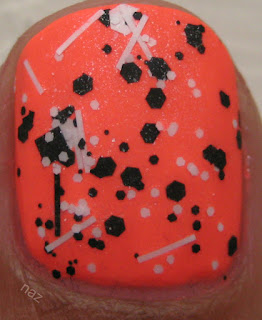
I'm not really sure how, but Sunshine Energy made it into my Top 20! I didn't have photos of it on its own when I wrote the post, so I showed it to you as a base for Lynnderella Connect the Dots. This is that combination, with a matte topcoat:


Neon cremes and Connect the Dots are a match made in heaven.


It looks like there are flecks of white dust or something on the surface of my thumbnail, but that's actually the speckled white shimmer in Connect the Dots, and it doesn't actually look like dust in person.

Thanks for looking!