Friday, August 16, 2013

China Glaze L8R G8R

China Glaze L8R G8R was released with the Spring 2008 OMG collection. All the OMGs are named after text-speak abbreviations, like LOL and IDK. Coincidentally, this afternoon I'll be saying "L8R G8R" to my internship! I'm really thankful to have been employed (and PAID), but I am ready to go back to class. Well, not Chemistry...I'll never be ready for Chemistry. >___>

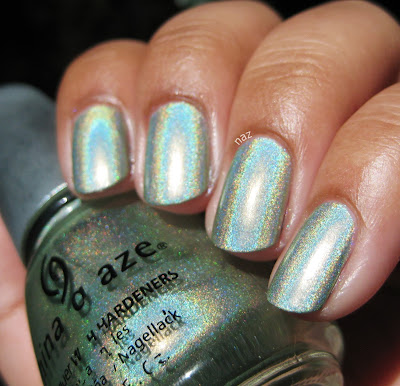
Anyway, L8R G8R. It's a light, yellow-toned green linear holo. In the shade:


You can see a faint hint of holo, but it's a fairly boring color in the shade, IMO. In the sun:


Nice and rainbow-y! I have to admit, the base color is not my favorite. And I am not crazy about the formula either. It's a thin and watery 3-4 coater, and definitely the worst of the OMGs I've tried. But it sure does look pretty in the right lighting.

Oh, and make sure you don't use a base coat. You will regret it if you do.

Nfu Oh 66 looks similar, but more holographic, cooler-toned, and more silvery. Layla Jade Groove is the same way. Pupa Holographic Light Green looks pretty similar, but Pupa is a European brand.

Have you tried L8R G8R? Thoughts?

Thanks for looking and commenting, and have a great weekend!

Wednesday, August 14, 2013

Color Club Harp On It

Color Club Harp On It is part of the first six Halo Hues released in late 2012. It's a flashy silver holo, and I am just smitten. Here it is in the shade:


Look how holo it is, even in the shade! With the holos that were available a couple of years ago, you'd be getting this in bright, direct sunlight. Harp On It, in the sun, is amazing.


Eeeeee. So pretty. I had some trouble with the formula, but I think that was because I used a base coat. Regardless of the patching, it evened out nicely in 2 coats, and it dried fast, so that's good.


I find that with holos, when my camera tries to focus on the rainbow-y particles, it winds up dimming the effect in photos. So if you look at my index finger in that last photo, which is not as focused, that's much closer to what Harp On It looks like in person.

How do you feel about the Color Club Halo Hues? What's your favorite silver holo?

Thanks for looking and commenting, and I hope you're having a great week!

Monday, August 12, 2013

Reswatch: Essie Ole Caliente

Essie Ole Caliente was from the Spring 2012 Navigate Her collection. I wore it again as a pedicure recently and thought, eh, it's been over a year since I first blogged this polish, why not reswatch? I'm still not crazy about it as a manicure, but like Where's My Chauffeur, it looks even better with a tan.


Last time I wore this, I noted that four thin coats was the way to go. Ole Caliente has thickened up in that time, and was nearly solid in 1. I should have given it time to dry between coats though, because I wound up needing 3 coats to even it out anyway because of the streaking.


Oh, and just a quick note about the color: Ole Caliente isn't this orange on me IRL. It's more pink, and it's definitely brighter. My camera apparently had trouble with this color, too.


I remember reading last spring that Ole Caliente is either identical or very very similar to OPI Red Lights Ahead...Where? which was released at the same time. And this year's Resort collection brings us another near-dupe, called Come Here. Let's be honest, this isn't a very unique color, lol.

Have you tried Ole Caliente, or any of the countless similar colors? What do you think? Do you like bright pinks and corals on your fingernails, or are you like me and reserve them for pedicures?

Thanks for looking and commenting, and have a great week!

Friday, August 9, 2013

Essie Where's My Chauffeur?

Essie Where's My Chauffeur was released with the Leading Lady collection this past holiday season. I also bought Leading Lady, which you will hopefully be seeing...sometime in the near future. Where's My Chauffeur is a bright aqua creme, not really what you'd expect for winter but very bright and cheery, especially with a summer tan.


Where's My Chauffeur has a pretty standard Essie creme formula, almost perfect in 2 coats but still requiring a third to even out some streaking.


The formula was thick, but manageable, and I didn't need to do much cleanup on this mani, which was nice.


I typically dislike these kinds of colors because they're so white-based, and I don't think they're flattering on my skintone at all. But this is so saturated and cheery, I can't help but love it! I really want to water marble with this one. Maybe with OPI Vampire is Buff, or something.

Where's My Chauffeur is very similar to China Glaze Aquadelic, from last spring's Electropop collection. It's also similar to China Glaze For Audrey, which is very very popular. Personally, I prefer the Essie, as it's a smidge darker, and definitely more saturated.

Have you tried Where's My Chauffeur, or any of the other similar aqua cremes? Thoughts?

Thanks for looking and commenting, and have a great weekend!

Wednesday, August 7, 2013

Wet n Wild Under Your Spell + Comparison

Wet n Wild Under Your Spell is one of the Megalast colors. Truth be told, I have no clue whether it's core or LE, but it seems to have been released in early 2010. It was sitting in the rack at a local CVS, and since I had some Extrabucks, I figured, why not? Besides, I thought it might be a good, cheap alternative to my beloved OPI Royal Rajah Ruby. More on that later, but in the meantime, Under Your Spell. Here it is in the shade:


Since it's a vampy shimmer, same caveat applies: it's dark and my camera freaked out, you know the deal. The shimmer isn't super prominent in the shade, but it's certainly more visible than OPI Black Cherry Chutney. Now, take a look at it in the sun:


Muuuuch better. As you might be aware, the not-so-new-at-this-point Megalast polishes have biiiig brushes. They are big, and they are fluffy, but they aren't as bad as you might expect. It was thin and watery on the first coat, but I was pleased to find that it was solid in 3 coats. I figured I was going to have to layer it over black to reach opacity, but fortunately that isn't necessary!


Now, let's see how it compares to Royal Rajah Ruby. Royal Rajah Ruby is on my index and ring fingernails, and Under Your Spell is on the middle and pinky fingernails.


They do look quite similar! Royal Rajah Ruby has warmer, more prominent shimmer.


Okaaaay, to most people I guess they're pretty much the same. And it'll do as an alternative, but I have to admit I still like the OPI better.


Now the difference is a little clearer. It's not too obvious in this photo, but Royal Rajah Ruby has a reddish/brown base, whereas Under Your Spell is black-based. The OPI is also more opaque.

Thoughts? Are you as weird and picky about basic dark red shimmers as I am?

Thanks for looking and commenting, and I hope you're having a great week!

Monday, August 5, 2013

OPI Black Cherry Chutney

OPI Black Cherry Chutney is from OPI's Spring 2008 India collection. Most of the colors were quite boring to me, but the two vampy shades, for some reason, are freakin' awesome to me. OPI Royal Rajah Ruby, as you might possibly be aware, is my absolute favorite nail polish, and while Black Cherry Chutney isn't quite that awesome, it is pretty great in and of itself! In the shade, it looks like a vampy creme, and I tried to photograph it but it's so dark my camera had a bit of a freakout.


I'd say that's a pretty accurate depiction of how it looks in the shade, but it's so dark my camera freaked and decided to make my skin look super pale. I'm pretty sure my skin hasn't been that light since I was a year old, hahah. But, check it out in the sun!


Eeeeee. So pretty.


I am smitten with this shimmer. The formula wasn't bad, a 3-coater for me, but I think the brush was cut a little funny in this one because application was sort of tricky.


Being a vampy shimmer, OPI Black Cherry Chutney probably has a toooon of dupes. OPI Every Month Is Oktoberfest is similar, but cooler-toned, and Midnight in Moscow is warmer, so the opposite. I mean, there are many colors like this. This happens to be a pretty good one, but it's hardly groundbreaking, haha.

Have you tried Black Cherry Chutney, or any of the other India colors? Thoughts?

Thanks for looking and commenting, and have a great week!

Friday, August 2, 2013

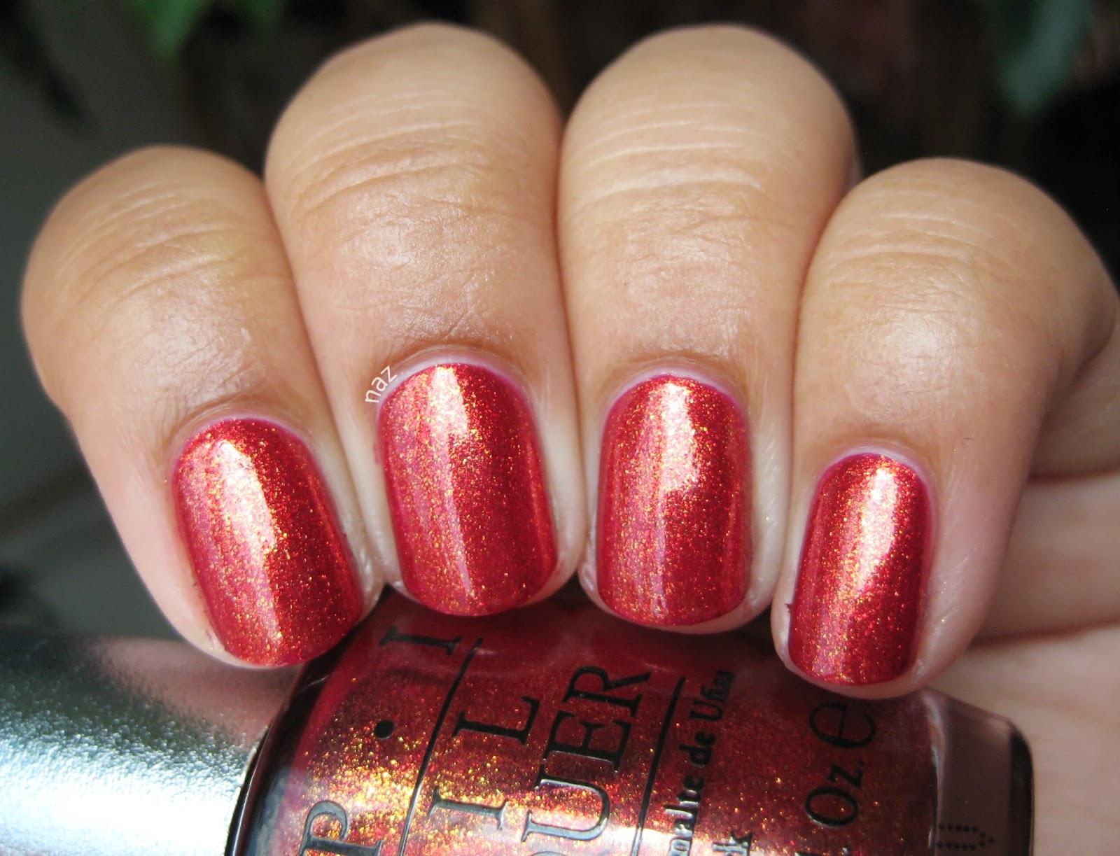
OPI DS Indulgence

HAPPY FRIDAY! I don't know about you guys but I am SUPER stoked this Friday. Why? My presentations are over. They weren't formal presentations or anything, more like standing in front of my poster and presenting to whoever walked up and asked me about my project, but it went on for five hours. Also, my lower back and I learned the importance of supportive shoes. Oy. Anyway, I am so relieved, and it wasn't as bad as I had expected it to be. So let's end the week with one of my new favorites.

OPI DS Indulgence was one of two Designer Series colors released in Fall 2012. The other was Luxurious, a fiery orange foil that is quite pretty, but not really my thing. Indulgence, on the other hand, is perfect.


This is three thin coats, with no top coat. Application was excellent, and I didn't even have to clean up!


That gold shimmer is even more spectacular in the sun.


In case you couldn't tell, I'm really excited about this. More Top 20 material!

Zoya Kimmy and Zoya Reva struck me as similar, but they seem more foil-like, and Reva is more berry/pink. I do like the Zoya foils I've tried, but out of the three I'd go with Indulgence, personally. If you're in Europe, check out P2 Hot Berry! Like Kimmy, it is more of a foil than Indulgence, but the gold shimmer looks nice and visible.

Have you tried either of the two OPI Designer Series from last fall? What do you think?

Thanks for looking and commenting, and have a great weekend!