Wednesday, September 21, 2011

OPI Catherine the Grape

Hello! Today I have OPI Catherine the Grape to show you. This one isn't actually mine - I borrowed it from a close friend who also likes polish, but I think I need a bottle for myself, because this one is AWESOME. This is an uncharacteristically conservative color for me, but I absolutely love it. It flowed on nicely in 2 smooth coats, and for once, that stupid Pro-Wide brush wasn't an impediment!

Catherine the Grape is a warm plum with gold, copper, and tiny specks of burgundy shimmer. My skin is pretty warm-toned, so this color was very flattering on my hands. Click on the picture to enlarge, if you want!


Catherine the Grape was released with OPI's Russia Collection in Fall 2007. If I am not mistaken, this was a green-label OPI, so it's 3-free. Many colors from that collection, including this one, have been discontinued, but this one still isn't very hard to find. It showed up at my local CVS, but of course, that was the day I didn't have enough cash with me to buy it. D'oh! Oh well. It'll turn up eventually...

Friday, September 16, 2011

Milani Dot Com

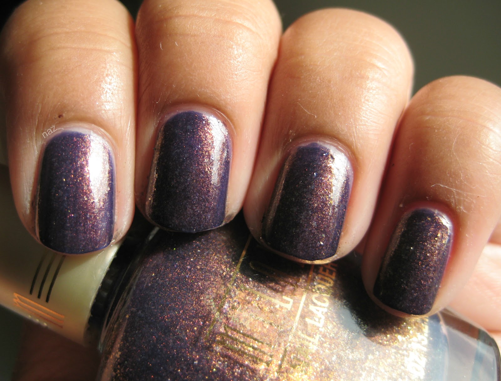
Happy Friday, everyone! Today I have a random find to show you - Milani Dot Com. There's a similar color from Milani as well, called Totally Cool, but it looks like that one is more of a jelly than this. Neither Totally Cool nor Dot Com have actual spots in Milani core displays...I found Dot Com sitting next to a box of Orly minis in a CVS that time forgot.

Dot Com has a blueish purple jelly base, with a ton of awesome gold and copper shimmer. My skin color tends to draw more attention to the copper and gold than the purple, but I love this color all the same. My mom loves it too! As usual, you can click on the photo to enlarge if you'd like!


This is 3 coats, plus top coat. It dries kinda dull, so top coat is a must, but I think the end result is worth it. This one definitely has a place in my top 20!

Thursday, September 8, 2011

Purple Jelly Sandwich!

Jelly sandwich manis (glitter sandwiched between layers of jelly polish) have been pretty popular on the Nail Board lately. They're super shiny, super sparkly, and they have lots of depth. This is my first try at one. If you'd like, click to enlarge!


This is 1 coat of Sally Hansen Xtreme Wear Purple Pizzazz, 2 coats of OPI Last Friday Night, and 2 more coats of Purple Pizzazz. 

Tuesday, September 6, 2011

Essie Pretty Edgy...Why do you hate me???

Essie Pretty Edgy is such an awesome color - a vivid, grassy green creme. But man, the formula on this one is so terrible! I definitely need to change up my application style next time I wear this one, because I got a ridiculous amount of bald patches on every single coat. Ordinarily, I wouldn't photograph such an awful application, but I figured I'd display the hoops I had to jump through to get this one even and opaque. 3 awful coats.


Believe it or not, the photo actually downplays some of the unevenness. Yikes. I tried adding a coat of Pure Ice Heartbreaker, which looked really cool, but it didn't help even it out much. Even top coat didn't help as much as I would have liked. Here it is with a layer of Pure Ice Heartbreaker and top coat (I use Out the Door).


Le sigh. I am determined to make this polish work for me!

Thursday, September 1, 2011

My first attempt at a half-moon mani....

I can't really say it went too well, but at least I tried! This was for the premiere of Harry Potter and the Deathly Hallows, Part 2! I always liked Slytherin best, so I chose Slytherin colors for this mani. I used Illamasqua Rampage for the green, and Essie Loophole for the silver. Rampage is seriously one of the best greens ever!! I'll cover it in a separate post because it is so amazing! A forest green jelly, opaque in 3 coats. Essie Loophole is a slightly frosty silver...I'm not a fan of it on its own, but it makes a pretty good base for Rampage.


As you can see, I have a LOT of work to do on my half-moon manis.....I have no illusions that this one is a mess! I do like the colors together though. I think I just need more practice with those reinforcement labels...

Thursday, August 25, 2011

Essie Starry Starry Night

Today I have Essie Starry Starry Night to share with you. It's become a rather hard-to-find gem...but if you find it at a good price, it's completely worth it. Sadly, I only have half a bottle of this beauty, but I can't complain, considering I was sold this half-bottle for $3. Had I gone to Ebay for it, I would've paid upwards of $100. Not happening. I have to say....it's kind of overrated, but it's really pretty nonetheless. If you want, you can click to enlarge the photo so you can see the detail!


As soon as I find a good navy blue jelly, I'm off to franken a backup for this one. 

Wednesday, August 24, 2011

First Post: Estee Lauder Surreal Violet!

I've been toying with the idea of starting a nail polish blog for a while now, and I finally decided to give it a shot! If nothing else, this will at least give me a place to compile all my photos. I still have a lot to learn about application and taking photos, but hopefully you'll see some improvement as I continue to post!

As you might have guessed, today's post deals with Estee Lauder Surreal Violet. 

I'm not a fan of the size and price of Estee Lauder polish. 0.3 oz for $18? Seriously? I have to admit though, Surreal Violet is amazing. It's a really nice, understated neutral with amber shimmer. On me, it turns into a purple-ish beige.


The formula is decent, but it's definitely a 3-coater. I know a lot of people hate the wide brushes present in Dior and Sally Hansen Complete Salon Manicure polish, but the brush on Estee Lauder polish makes application a lot easier for me.