Friday, January 27, 2012

Franken Friday #3

Good morning! Today's franken was partially inspired by Dior's Garden Party collection for Spring 2012. The collection includes two lacquers, Waterlily and Forget Me Not, pictured below:


(screenshots taken from Dior's online store)

They're both very pretty, but I was/am swooning over Waterlily! It's sorta like Chanel Jade and Milani Dressmaker, but with silver shimmer rather than green...I swatched it at a department store and it was just as beautiful in person...and then I caught a whiff of that scent. Rose scent. I hate rose scents. I set out to find a satisfactory light green, but they're all too blue-toned. I considered Orly Mint Mojito and Nubar Green Tea, but they're not available at brick and mortar stores in my area, and I don't like buying polish online. So I changed my mission: franken a satisfactory light green.

I started with NYC Taxi Yellow Creme, and various blues, including $OPI Slushied, Ruby Kisses Regaled Out Blue, and SHCSM Navy Baby. Yellow polishes are notorious for their difficult formulas, so I was hoping I could thin the yellow out with some clear and use more blue to make it less troublesome, but that didn't work. My first attempt wound up being completely blue, with a hint of yellow shimmer. Then I decided to carefully add drops of blue at a time to the original bottle of yellow, and it worked! I think I used 15 drops of Regaled Out Blue in 3/5 of a bottle of Taxi Yellow Creme. This was the result:


Completely different from Dior Waterlily, but I'm very happy with the color nonetheless. There's just one problem: since it's almost entirely made up of yellow polish, the formula is a total nightmare. It definitely needs 4 coats, and it's extremely prone to patching and balding. In order to get even, opaque color, thick coats are required, and though I didn't get any bubbling this time, I'm worried that it might be an issue  when I wear this later on. You can see the uneven surface here:


It's not that bad, but it's definitely not a smooth, even surface like I would prefer. It is unique though, and it's a fun, cheery color! A great distraction from a bleak and dreary winter season.

Thanks for looking!

Monday, January 23, 2012

William Tell Me About OPI + Finger Paints Sparkle Effect Topcoat

William Tell Me About OPI is a super dark raisin creme from OPI's Swiss-themed Fall 2010 collection. When the collection first came out I though "Meh, boring. Not interested." and yet I eventually wound up with 3 of them (Lucerne-tainly Look Marvelous, Ski Teal We Drop, and William Tell). I'm not one to get a color from each collection just to have it, nor am I one to buy entire collections, so the fact that I have 3 of them is surprising.

Despite the fact that OPI stuck Pro-Wide brushes on their polishes and I'd much rather be painting with a floppy mop, William Tell Me About OPI was shockingly easy to apply. It has a very nice, smooth formula and is nearly opaque in 2 coats, but I used a 3rd for good measure. Here it is without top coat:


So glossy! It's pretty dark, and does look black sometimes, but most of the time you can tell it isn't. Here it is in direct sunlight:


It's a bit conservative compared to my usual choices for nail color, but I love it. I thought I'd add a layer of Finger Paints Sparkle before removal just to see how it turned out.


Not too bad. Sparkle definitely needs a blue or purple base color to work though, and it's more dense than I would like. I might decant some for a franken, since it's nice and glass-flecked.

It's apparently a dupe for CND Raspberry Sparkle, as well as Dollish Pollish Aurora Australis and Nostalgic Lacquer Magic Dance. Actually, Nostalgic and Dollish Polish have trios of effects that are identical to each other, and at least 2/3 are identical to CND Effects (raspberry and sapphire sparkle). I haven't compared prices but know that you've got several options. As far as Raspberry Sparkle goes, if you can find Finger Paints Sparkle Topcoat that would definitely be cheapest. I got it on clearance for $1.99 at Sally Beauty Supply.

Sparkle has a slight multichromatic shift, from pink to purple to yellow-gold. It usually just looks purple but sometimes you can coax the pink and gold out.


Thanks for looking!

Sunday, January 22, 2012

Hard Candy Envy + Comparison

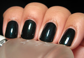
Hard Candy Envy is a blackened emerald shimmer. In some lights it does look black, but the green shimmer is vibrant and almost always visible. It took 2 coats for opacity.


This was actually one of the colors that started my polish addiction a little over a year ago. I love green, I love dark colors, and I love shimmers, so this is pretty much perfect for me.


I read somewhere that Envy is a dupe for Deborah Lippmann Don't Tell Mama, so I thought I'd swatch the Lippmann next time I went to Nordstrom. Here they are side by side, 2 coats of Envy vs. 2 coats of Don't Tell Mama:


Not quite dupes, but very close. Honestly, the differences you can see in this photo aren't all that visible in person. I kept forgetting which fingers had which polish on, but you can see here that the Lippmann is more of a dark teal shimmer than green, and it looks like there's a bit more blue in its base color. Envy just has a black base.

Thanks for looking!

Saturday, January 21, 2012

Sally Hansen Gem Crush - Showgirl Chic and Big Money

Looks like we've had a ton of full-coverage glitters lately, like the Wet n Wild Ice Baby and China Glaze Eye Candy collections. Sally Hansen's take on the trend is the Gem Crush collection. Personally, I didn't find them to be particularly interesting, and many of them are dupes or near-dupes to glitters that already have been released by other brands. Showgirl Chic and Big Money, however, caught my eye.

Showgirl Chic consists of superfine square silver glitter and small blue hex glitter, and is very very similar to China Glaze Lorelei's Tiara. However, the blue hexes in Lorelei's Tiara are more aqua, and Showgirl Chic has hexes that are closer to a true blue. I didn't realize how dense these glitters are, so I chose to layer 2 coats of Showgirl Chic over 2 coats of Orly Shine, a silver foil that I'll show you some other time.


I didn't use any top coat either. The texture and sparkle are really cool-looking without it, so I decided to go without for these photos.


So flashy. So obnoxious. So awesome.


And here is Big Money. Cool-toned superfine gold square glitter mixed with small lavender hexes. I chose to wear this one on its own. 2-3 coats for opacity, depending on how thickly you apply it.


Interestingly enough, Big Money really changes when you look at it in direct sunlight or shade. Direct sunlight turns the gold glitter into more of a beige or champagne color, and the lavender hexes look like a dusty light purple rather than lavender.


Shade, on the other hand, warms up the glitter quite a bit. The lavender hexes look lilac and are much lighter now.


And here's the obligatory closeup:


Good stuff. I don't plan on buying any of the other Gem Crush polishes, but I'm very happy with the two that I've got.

Thanks for looking!

Friday, January 20, 2012

China Glaze GR8 + Franken Friday #3

For today's franken, I started with China Glaze GR8, a yellow/gold linear holo. The formula was smooth and GR8 was opaque in two coats.


The only problem? The color...not so flattering. It's like mustard, and it's weird. No me gusta. So I dumped out a little bit and replaced it with a blue jelly, Ruby Kisses Regaled Out Blue. I'm much happier with the result! Still opaque in 2 coats, but now it's a sea green linear holo. Here it is in direct sunlight:


It refused to photograph accurately though, so here's a color-accurate photo I took in the shade.


It's a weird photo and I'm not sure what's going on with my skintone, but it at least shows you what color the polish actually is! I tried photographing it in my usual lighting setup but that was even less accurate than the sunlight photos, as you can see...


It looks a lot like DV8 there. Here's a comparison between the franken, DV8, and L8R G8R under artifial light:


In direct sunlight:


As you can see, DV8 is much bluer than my franken. It doesn't even look teal in comparison, whereas L8R G8R practically looks silver rather than the celadon green that it actually is.

Thanks for looking!

Saturday, January 14, 2012

OPI The One That Got Away

The One That Got Away is from OPI's Katy Perry Collection, which was released in January 2011, if memory serves. Not a particularly spectacular collection, though it did feature Black Shatter. Both the glitters have cheap drugstore dupes or approximations, and Not Like the Movies is yet another victim to OPI's stellar quality control...but I digress.

Pink and gold foil-y glass flecks in a raspberry/magenta base. Once again, not in my comfort zone, but for some reason I was drawn to this color. In order for the shimmer flecks to show through, a jelly base is necessary, so it definitely needs 3 coats for opacity, but the resulting depth is so worth it. This is how it looks in most lighting conditions:


But angled against the light source, you can see the gold flecks.


And in the shade, you can see the true depth of this polish.


It's so glossy and sparkly, even without top coat! A closer look at it:


To be honest, I'm not sure how I feel about The One That Got Away on my longer nails...it feels like it's a little bit much. A little ironic coming from someone who wears bright blues and greens with ease, but pink is a little weird for me! It's a very pretty color though, and makes for a great pedicure. Thanks for looking!

Friday, January 13, 2012

Franken Friday #2 + Finger Paints Asylum

Today's franken isn't a particularly interesting one, but it's a 1-coater and I'm quite fond of it all the same. The only problem is...I couldn't get it to photograph in such a way that it didn't look identical to the first one! It's a greyish blue, and it's very clearly blue in person, but every photo I took of the darn thing just looks grey.


Yeah.....it just looks grey. It's not, I promise! I added 3 coats of Finger Paints Asylum over top. Asylum, like Flashy, is super sparse...


A closer look at the flakies in Asylum:


Before I took it off, I decided to try it with a matte top coat, and I'm very happy with the result!


And a closeup of the flakies with matte top coat:


Thanks for looking!

Friday, January 6, 2012

China Glaze Glittering Garland

China Glaze Glittering Garland is from the Let it Snow collection, China Glaze's Holiday 2011 offering. To be honest, I didn't find the collection all that interesting, but Glittering Garland is AMAZING. It's got gold and green glass-flecked glitter in a dark green jelly base. It's similar to Orly Meet Me Under the Mistletoe, but it's more opaque and more of a yellow-toned green, whereas the Orly is much more blue and closer to a pine green.

Glittering Garland is surprisingly opaque and glossy! This is 2 coats, no top coat:


Here it is in indirect light to give you a better idea of the type of shimmer that's in it:


So gorgeous! After wearing that orange, I needed something that was more in my comfort zone, and you can't get farther into my comfort zone than green and glass-fleck. Here's a closeup of the shimmer:


Thanks for looking!

Wednesday, January 4, 2012

Essence What Do U Think? + Essie As Gold as it Gets

Good morning! Today I have a not-so-premium polish to show you. Bonus points if you get the reference!

Essence What Do U Think? is one of the known dupes for Chanel Orange Fizz, and is the most easily accessible here in the US, since Ulta sells Essence Colour & Go polishes. The other dupe that I know of is Catrice I Scream Peach! but as far as I know, Catrice isn't available here.

I can safely say that between the formula and the brush, What Do U Think? is one of the worst polishes I've used in a long time. The formula is thick, chalky, and very streaky, so you need at least 4 coats before it will even out. And despite the fact that these polishes are marketed as quick-dry, it took a very long time to dry. Longer than normal polish, even, although that could also be attributed to the excessive number of coats required. I even wound up with bubbles on my pinky. Not cool.


Check out those bubbles. Cute. That said, this really is a nice color. Orange is pretty far out of my comfort zone, but I really like the color. It's soft and vibrant at the same time. In the bottle, there is some sparse golden shimmer, but that barely shows up on the nail. I was originally going to wear this on its own, but those bubbles were driving me nuts, so I layered a coat of Essie As Gold as it Gets on top. Here is the result:


Not only do the sheer golden flakies in As Gold as it Gets look awesome over a lighter base color, they even camouflaged the bubbles and other such flaws in my application! Have a closer look at the texture and shimmer of the Essie:


Thanks for looking!

Monday, January 2, 2012

Deborah Lippmann Razzle Dazzle

Thought I'd give you a closer look at one of my Top 20 polishes! Razzle Dazzle is magenta glitter in a dark raspberry jelly base, and it is nothing short of spectacular. It's sparkly and glossy and has loads of depth. It needs 3 coats for opacity, but it also has the typical smooth, self-leveling, quick-drying Lippmann formula. This is how it looks whenever you're inside or in indirect light:


In sunlight, the glitter is much more visible, and you can see the true depth of this polish. By the way, despite the density of the glitter, it only required one coat of Gelous to be completely smooth!


And here's a macro:


So awesome. And this is one of the Lippmanns that hasn't been duped yet!

Thanks for looking!