Thursday, February 23, 2012

Essie Poor Li'l Rich Girl + Finger Paints Asylum

Essie Poor Li'l Rich Girl is a cool-toned red jelly from the 2004 Winter collection, Frozen Assets. This collection was released before Essie made the switch to a Big 3 Free formula, so Poor Li'l Rich Girl is chock full of toluene and whatever else Essie put in their formula before. It smells terrible, and I have to make sure the windows are open when I'm using this polish, but it's fantastic! The formula is very smooth, dries quickly, and since it is a jelly, it's very shiny even without top coat. This is 3 thin coats over 1 coat of Essie Fill the Gap. I made sure each coat was completely dry before I added the next, just in case.


There is still some visible nail line, but it's barely visible in most situations. I know reds aren't the most exciting, but this is a really really great one.


Since I love layering and flakies, I put 2 coats of Finger Paints Asylum over the Essie, and while I'm not too crazy about the result, I don't think it looks too bad either.


Maybe a warmer red base would look better under Asylum? I do like how the blue flakies pop against Poor Li'l Rich Girl though.


Unfortunately, I think the Finger Paints flakies are sold out in most areas at this point, but if you like flakies, you don't have any dupes in your stash, and you come across them, they're definitely worth getting. I only have 2, Asylum and Flashy, but I'm happy with them despite the relative sparseness of the flakes.

Thanks for looking!

Thursday, February 16, 2012

Sinful Colors Mint Apple

Good evening! Sorry I've been MIA for the last few weeks; the spring semester started recently and I'm still not quite used to my schedule. But today, I come with an awesome drugstore polish! I usually have trouble with pastels and minty colors against my skintone, but Mint Apple has enough yellow in it, and it's dark enough that it works. The formula is a little thin, so it needed 3 coats, but it's very smooth and I barely needed to clean up this mani. Here it is in artificial light, and as always, you can click on the photos to enlarge:


In natural light, it's a little more blue-toned, but not by a whole lot. In direct sunlight:


The shimmer is primarily silver, but you can see bits of yellow or gold shimmer! It's fantastic. In the shade, Mint Apple turns much bluer, but still not to the point that my hands turn into lobster claws.


It almost reminds me of a shimmery version of Essie Turquoise and Caicos in the shade. Such a fantastic color! And it's only $1.99 most of the time. Right now, Sinful Colors are 99 cents at Walgreens. I think that deal lasts for the rest of the week, but don't quote me on that.

Thanks for looking!

Thursday, February 2, 2012

MAC Ming Blue

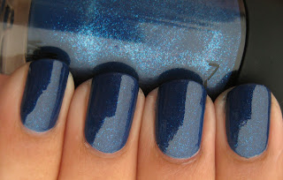
Ming Blue was originally released with MAC's fall/winter 2010 Nail Trend collection, which was full of interesting shimmers. MAC nail polish is, in my opinion, far too expensive for the quantity and quality, and the brush is really pretty terrible, so despite the pretty colors, I chose to just get Ming Blue.


A gorgeous medium blue with little flecks of blue and pink shimmer. It's not regular shimmer, it looks kinda like the flecks in glass-flecked polish, but in a creme base rather than jelly. The pink absolutely refused to show up on camera, but you can see bits of it in the bottle, I think. At first I was thinking "oh, a blue shimmer, how original," but Ming Blue is actually a lot more unique than I thought! I have more blues than any other color family, and nothing remotely like this. So pretty.


Ming Blue had better be glad it's so pretty, because I was ready to Hulk smash this thing. The formula is a nightmare. It's got a thin, watery formula, and dries super slowly. It needs 3 coats minimum, possibly 4 since it's also VERY prone to streaking. It really likes to pull at the tips too. I kept having to patch those in addition to those 3-4 coats. It also really likes to pool in your cuticles!!! Fun. So much fun. I was not pleased with the brush either.


But just look at that shimmer! Totally worth the trouble for a color like this.

Thanks for looking!

Wednesday, February 1, 2012

Quirius Sunshine Energy + Lynnderella Connect the Dots

Quirius is a less well-known brand, and one that I don't have much experience with, but turns out they make killer neons! murkyDismal on MUA posted a photo of Sunshine Energy, and despite the fact that I don't like pink too much, I don't wear much orange, and I'm not big on neons, I really really liked the color. Luckily, it was at a nail supply not too far from my house, and it was pretty cheap. $2 or $3 if I recall correctly. It's so insanely bright!

I first showed you Sunshine Energy as a base for Connect the Dots in my Top 20 post, but here it is on its own. You have to be careful with application since it's a neon and neons are pretty prone to streaking, but this one isn't bad at all compared to some others. 3-4 coats.


It photographs more orange than it is in real life, but it's awesome either way. I also like the typical flat, matte neon finish. I think it goes well with a color this loud and vibrant.


I'm not really sure how, but Sunshine Energy made it into my Top 20! I didn't have photos of it on its own when I wrote the post, so I showed it to you as a base for Lynnderella Connect the Dots. This is that combination, with a matte topcoat:


Neon cremes and Connect the Dots are a match made in heaven.


It looks like there are flecks of white dust or something on the surface of my thumbnail, but that's actually the speckled white shimmer in Connect the Dots, and it doesn't actually look like dust in person.

Thanks for looking!